
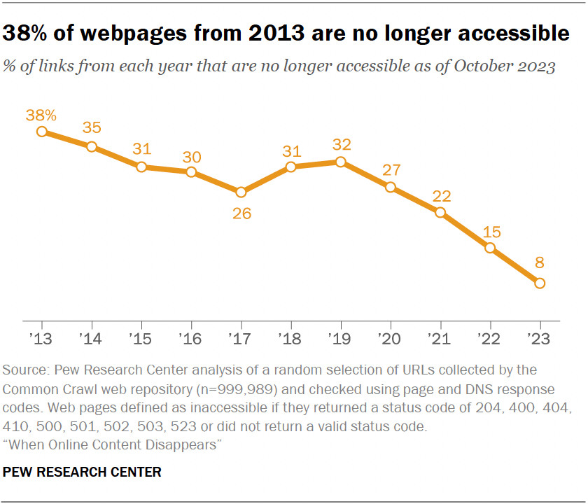
This is an interesting chart 📊, not just because of its content. The time axis here strikes me as relative rather than absolute, since the values aren't tied to the years. They'll be different next year, so they're relative to when the chart is made. From https://www.pewresearch.org/short-reads/2024/12/06/striking-findings-from-2024/sr_24-12-06_striking-findings_12/
Comments
With enough data you could make a nice “Medusa chart” showing both. Cc @toph.me