
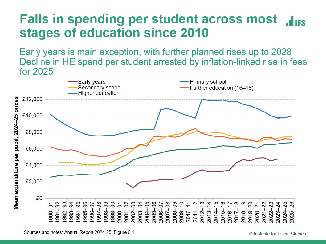
I am always super proud of this graph showing spending per pupil across different stages of education in England over time (from our latest annual report on education spending)
It shows a massive amount of information of how public spending priorities have changed over time
It shows a massive amount of information of how public spending priorities have changed over time
Comments
I wouldn't bet against a further narrowing
A planned £4bn increase to early years spending and likely cuts to other stages of education will probably already have this effect