ThreadSky
About ThreadSky
Log In
jowolff.bsky.social
•
19 days ago
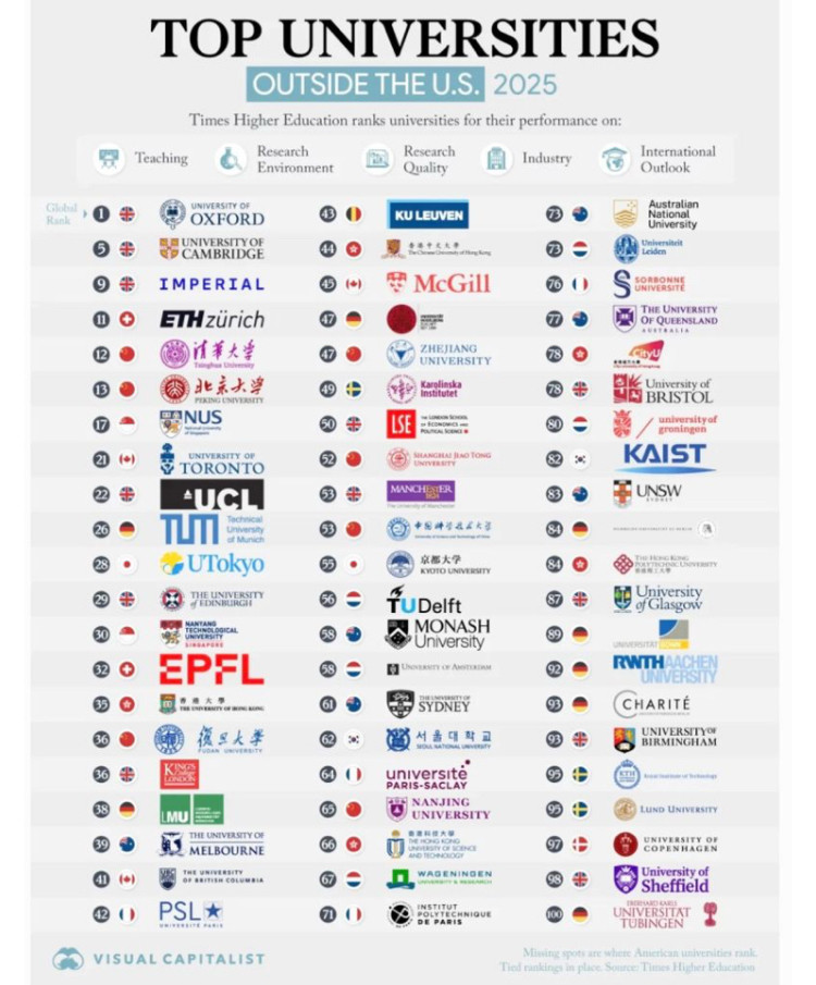
The only thing it’s fair to conclude from this chart is that even soft drinks have better logos than universities.
Comments
Log in
with your Bluesky account to leave a comment
[–]
gregorydavis.bsky.social
•
19 days ago
Reassuring!
2
reply
[–]
satin665.bsky.social
•
18 days ago
EPFL and KAIST look like they are auto part manufacturers.
0
reply
[–]
hornlm.bsky.social
•
19 days ago
Universities don’t need catchy logos.
3
reply
[–]
tomslists.bsky.social
•
18 days ago
Universities shouldn’t have logos. Just the name in no-nonsense plain type
1
reply
[–]
afib.bsky.social
•
19 days ago
Some surprises in there. Would have expected LSE far higher, not seeing Durham or St. Andrews (although perhaps the criteria for this particular selection militated against those latter two).
1
reply
[–]
irynacranny.bsky.social
•
19 days ago
It’s a mess 😀
There is one very good logo in the US though
1
reply
[–]
susankay81.bsky.social
•
18 days ago
Universities don't have advertising budgets as large as those of soft drinks companies-- and they shouldn't.
2
reply
Posting Rules
Be respectful to others
No spam or self-promotion
Stay on topic
Follow Bluesky's terms of service
×
Reply
Post Reply

Comments
There is one very good logo in the US though