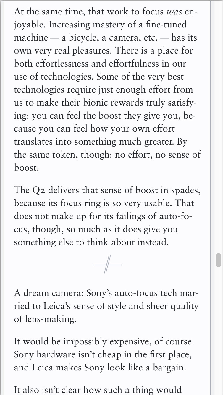
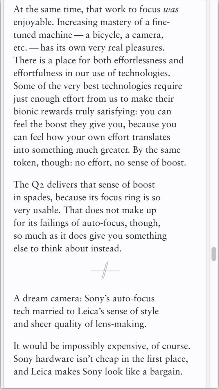
…mean some paragraphs end up a solid 2–3em narrower than those above or below them. It’s visually jarring and feels like a mistake. I’ve attached the same section of https://v5.chriskrycho.com/essays/the-leica-q2/ with and without `text-wrap: pretty`, which I think shows it pretty clearly. The same effect is…
1 / 2


Comments
Just to be extra clear: I’m flagging this because I *love* the work you’re doing in this space and think directionally this is fantastic!