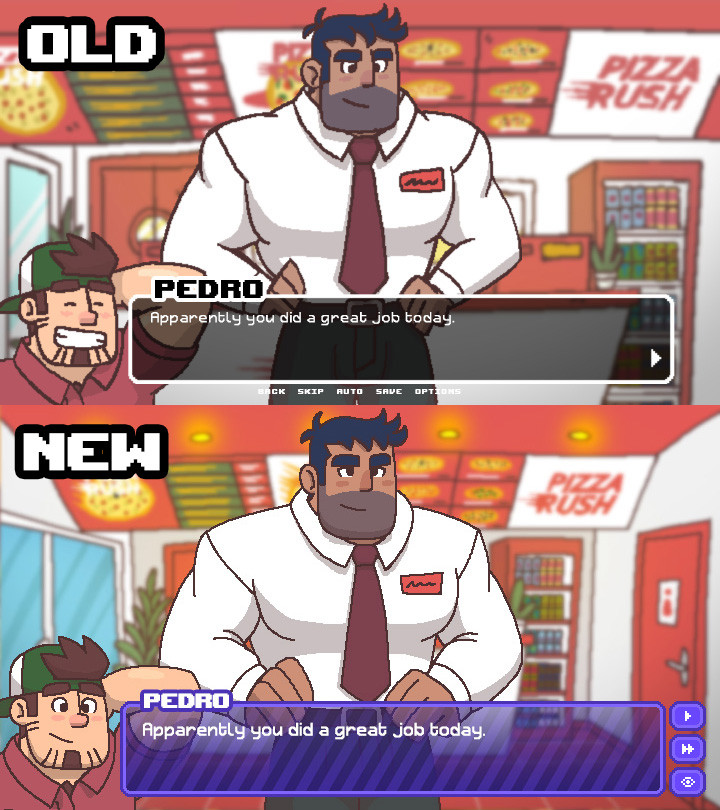
I think the new is a big improvement. Much crisper overall. While I like the new chat box/menu layout, I think I prefer the black and white colour scheme and I think the diagonal lines on the new version do interfere a little bit with text legibility.
I think the new one is better looking. As for the eye placement for Pedro, I definitely think the looking forward look is a bit more engaging. Having him look at the text box feels like he's talking to a waaaay shorter character.
New, mostly for the clarity of the useful buttons on the side instead of underneath the textbox.
I prefer the old textbox, though. The simplicity is more appealing to me.
The new one looks sharper, and the little visual effect for the text box makes it fun to look at, although the diagonal lines could be just a little more faded so the contrast isn’t so big, y’know to prevent letters from blurring together in some cases

Comments
However, I like the old versions text box.
I prefer the old textbox, though. The simplicity is more appealing to me.