In the shirt I just launched I wanted to make a new logo that would represent this new transition and fit better with the type of work I want to do.
I had my old logo for 8 years or so and it represents a big phase in my career.
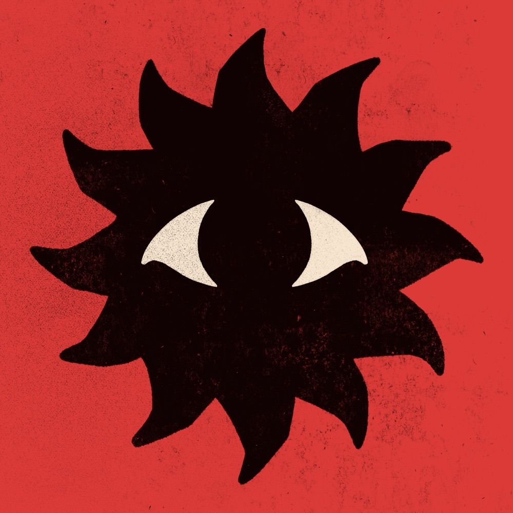
Here goes the first iteration, always a sun.
new logo, who dis?
I had my old logo for 8 years or so and it represents a big phase in my career.
Here goes the first iteration, always a sun.
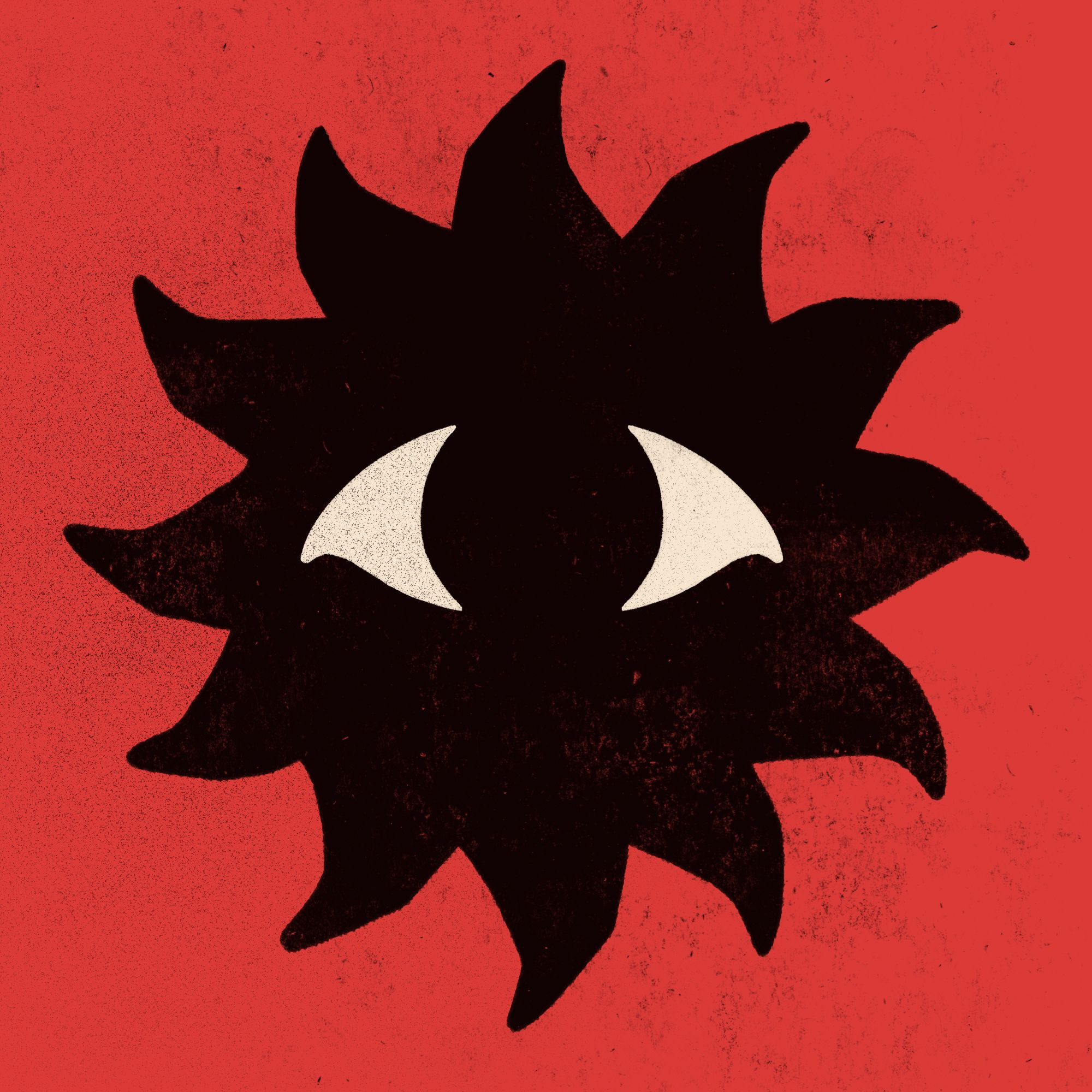
new logo, who dis?
1 / 2

Comments
Good luck with this new phase
I was inspired by old japanese prints where red and black are usually predominant. I wasn't so sure on the curves of the sun but I went with something that felt a bit more carved for now.
I'll also run some one tint versions where it doesn't feel as dark :)
I like both versions, but the new one looks nicely bold with the red hue.
Está de puta madre, sí
It reminds me of a soot sprite, I think it's very cool
But I really do like your logo. It’s very modern while also having that 1950s sci-fi feel.
It looks like it I picked it up it’d be made of rough paperstock (compliment™️)
( 👁️ )👍
Bulldog?