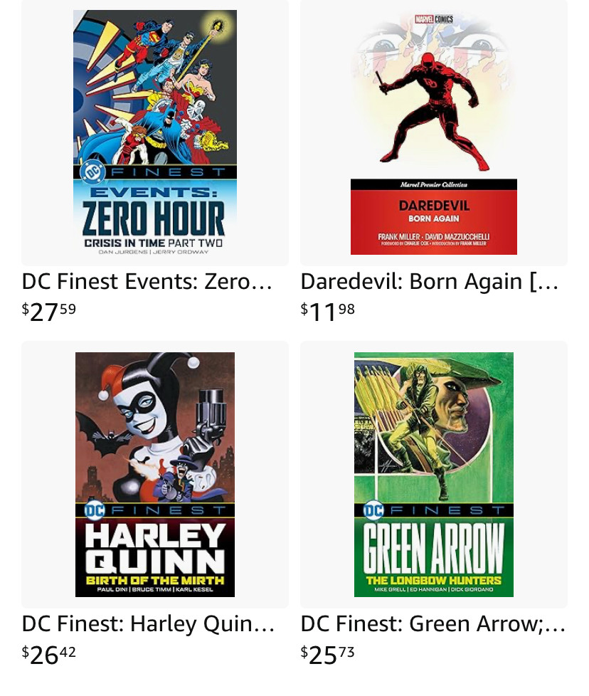
Perhaps this is an unfair (though random) comparison, but it strikes me that one major comics publisher is dominating the other when it comes to book design.
Comments
Log in with your Bluesky account to leave a comment
I am a 71 year old former Marvelite. They started to go downhill on or about the time you quit supplying them with great writing and Bendis left.
I almost exclusively read DC stuff now and a lot of it is because to the brilliant cover art and designs, especially the cardstock variants.
i think dc has always done a better job of design. something happened in the '80s when they decided comics weren't just for kids, and they started publishing trades.
watchmen, the dark knight returns, etc. big difference pre-crisis vs post-crisis, pre-Berger vs post-Berger.
Marvel's book lines have had pretty poor cover design for a while. I think maybe only the Penguin classics line and the expensive Taschen collections have had a consistent, professional look
A more fair comparison would be the DC Compact line compared to that Daredevil, as the DD book is part of a group of books created obviously in response to the Compact line.
But I think the Compact line design also looks better than that DD design. However, I'm no design expert :)
You want design experts building the designs; you don't need to be one to react to them.
Still, yes, the Compact Comics design looks like it was carefully planned, and Marvel's looks like it was just gotten out of the way without giving it any time or thought because everything else the designer...
To be fair, the spine of the that book looks like this and the title is black (and red) on a white background. In a bookstore it will be easy to read. And if they would always be styled the same it would be a nice looking collection on a bookshelf.
And so many books are sold outside of physical bookstores these days that it's not the only concern in design. I think DC's books will also look good on a shelf, while being more readable.
It is a pity that neither studio really gives their developers a proper amount of time to do their work. Publishing deadlines have become an art in ridicule at this point.
I like Marvel's Epic Collections, but last year's Daredevil: Born Again Gallery Edition, with its stupidly wide red vertical stripe that ate up valuable real estate on every page of the story, convinced me that no one cares overmuch how these things look.
I agree with you on that Gallery Edition. But the Epic Collections have a big problem with the subtitles/credits. When the template doesn't read well against the art, well, too bad, that's the template.
I also think that either the drop shadow on EPIC COLLECTION isn't pronounced enough or...
...they're picking bad colors. I think it'd be better on a banner like that if it wasn't dimensionalized at all. Maybe an outline, but keep the banner flat, let the art supply the depth.
[And not to be _too_ salty, but building off the fact that you've chosen to limit your logo colors to those of Nazi Germany is a choice. But is it a good choice?]
Fun fact: Goebbels was a student of USA propaganda (especially when it was deployed to get US support for entering WW1) those colour palettes may actually be ripped from America.....
Quite a long time ago at this point (according to Chip Kidd's BOOK ONE: WORK 1986-2006) publishers started thinking about thumbnails as much as the "from across the room" idea.
somehow it reminds me of the time when DC thought the solution to beating Marvel was better covers
Those checkerboard strips didn’t help but these covers might
I think both have leaned into standardized design, both for line-identity and convenience, but DC's tend to look like they've spent time creating a strong design for that purpose, and Marvel's look like they gave the designer five minutes, $15, and told them to shut up about "readability."
DC's wisely uses a font w/extra wide and extra narrow variants (and some digital squishing) so that no matter how long or short the character name it can be big and arranged to fill the space. The Marvel ones all use small type so the name will fit on every cover in the same type style/size.
Maybe it’s just because I don’t have the same affinity for DC that I do for Marvel, but they both just look all right by me. I kinda like the more minimalistic approach of the Daredevil book.
The DC Finest line is not even my favorite line of theirs, but they're attractive enough and they do their job well. And there are some truly lovely cover+book designs at DC. Often from their teams I see a respect for the form and the book as an object.
I read a lot of comics in the early ‘70s, fell off a bit in the mid-‘70s, and came back with the stories in this book. A mixed bag, for sure, but the nostalgia is strong.

Comments
The Epic Collections have a generally-good design, with some weaknesses, as I mentioned elsewhere in this conversation.
I almost exclusively read DC stuff now and a lot of it is because to the brilliant cover art and designs, especially the cardstock variants.
watchmen, the dark knight returns, etc. big difference pre-crisis vs post-crisis, pre-Berger vs post-Berger.
in my opinion.
But I think the Compact line design also looks better than that DD design. However, I'm no design expert :)
Still, yes, the Compact Comics design looks like it was carefully planned, and Marvel's looks like it was just gotten out of the way without giving it any time or thought because everything else the designer...
And so many books are sold outside of physical bookstores these days that it's not the only concern in design. I think DC's books will also look good on a shelf, while being more readable.
I also think that either the drop shadow on EPIC COLLECTION isn't pronounced enough or...
Those checkerboard strips didn’t help but these covers might
I remember thinking the stories were a very mixed bag, when they came out. But some of them are terrific.