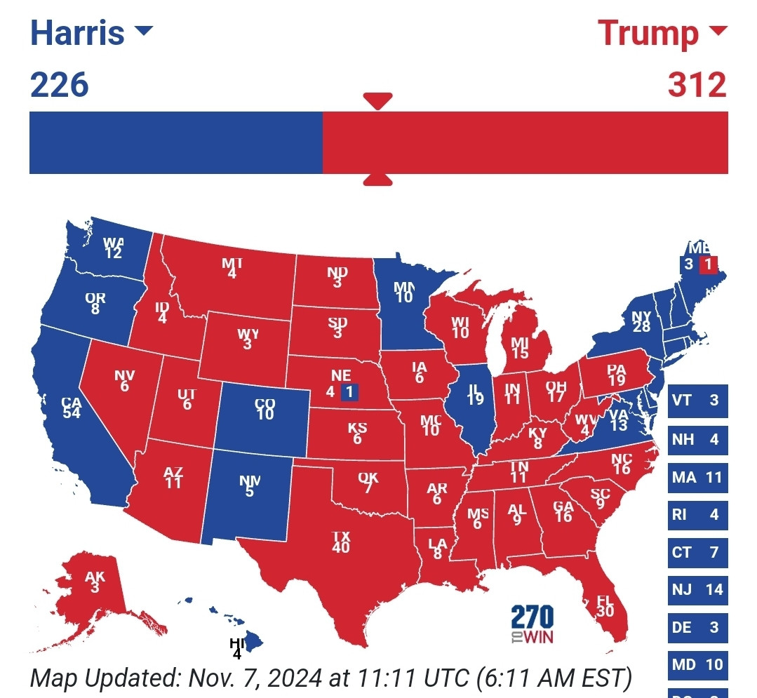
<25% of Americans voted for Trump, they use maps like the above one because it makes it look like the country is overwhelmingly Republican, but it’s not.
Land doesn’t vote, this example is from a previous election.
2/2
2. Votes are reported by jurisdiction in counties, not by individual.
3. US population - 335Mill(total, including NON voters)
Trump votes - 76Mill
Which = >25%
4. The "country" is equally conservative. Because if you look at the colors on the second pic, liberals are just more concentrated.
1/2
Not really a "great graphic", as @juliehutchinskoch.bsky.social wanted to say, and here's why.
1. One map is based on counties, while the other shows ONLY concentrations of people. Which is a PRIME illustration on why the electoral college is so important.

Comments
Land doesn’t vote, this example is from a previous election.
2. Votes are reported by jurisdiction in counties, not by individual.
3. US population - 335Mill(total, including NON voters)
Trump votes - 76Mill
Which = >25%
4. The "country" is equally conservative. Because if you look at the colors on the second pic, liberals are just more concentrated.
Not really a "great graphic", as @juliehutchinskoch.bsky.social wanted to say, and here's why.
1. One map is based on counties, while the other shows ONLY concentrations of people. Which is a PRIME illustration on why the electoral college is so important.