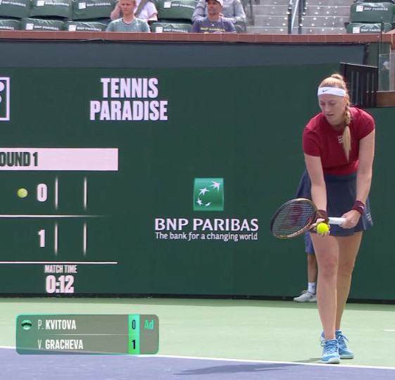
As much as I have questions about some of the WTA's choices on their new branding exercise, I will say the new scorecard looks *very* sharp on match streams.
Comments
Log in with your Bluesky account to leave a comment
Will get used to it I think. Branding & marketing is more than just colours and logos though, fingers crossed that they’re headed in the right direction.
being able to have one service to watch all the matches not majors (tc) is nice even if it sucks half the time. having to have wtatv and tennis tv would drive me crazy.
Or WTA TV. Been 7 long years of it and the product hasn’t improved once. Praying they sign a deal with ATP Media to get it back on Tennis TV’s platform.
I find it a wee-bit difficult to read with the colour scheme, personally, but my eyesight is also not the best sooooo lol I’m sure I will adjust eventually
They could do with a sliiiiightly less narrow typeface, I agree - think that’s an easy chance that wouldn’t impact the overall vibe they’re going for much.

Comments
i logged into tennis channel as well and the interface looks updated too.