
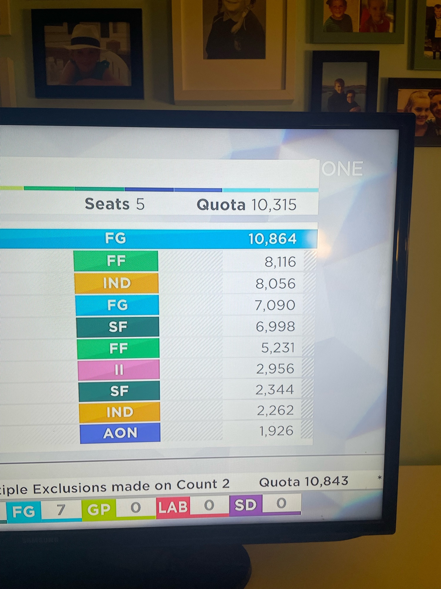
This is a ridiculously minor gripe in the overall scheme of things. The numbers are right justified, but the font/spacing makes it visually confusing. It looks, at a glance, like the 3rd placed candidate got more votes than the 2nd placed. The commas should line up, like on a spreadsheet. #GE24
Comments
Then give the user a configurable font so the exceptions are covered.