
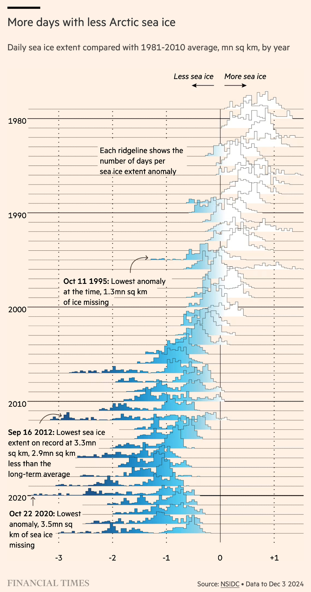
This ridgeline plot and the unconventional use of shading from white to blue to indicate sea ice loss is great. It also reinforces the impression of a dense ice pack breaking up.
Chart by @janatausch.bsky.social https://www.ft.com/content/63fbcf2b-9acc-4ccb-ac12-9f3b78e85b68?emailId=5d677b18-7750-407a-956c-4cec2b0d45f7&segmentId=ccee9840-6c9b-2776-04de-b87d446b96a1 #dataviz
Chart by @janatausch.bsky.social https://www.ft.com/content/63fbcf2b-9acc-4ccb-ac12-9f3b78e85b68?emailId=5d677b18-7750-407a-956c-4cec2b0d45f7&segmentId=ccee9840-6c9b-2776-04de-b87d446b96a1 #dataviz
Comments