
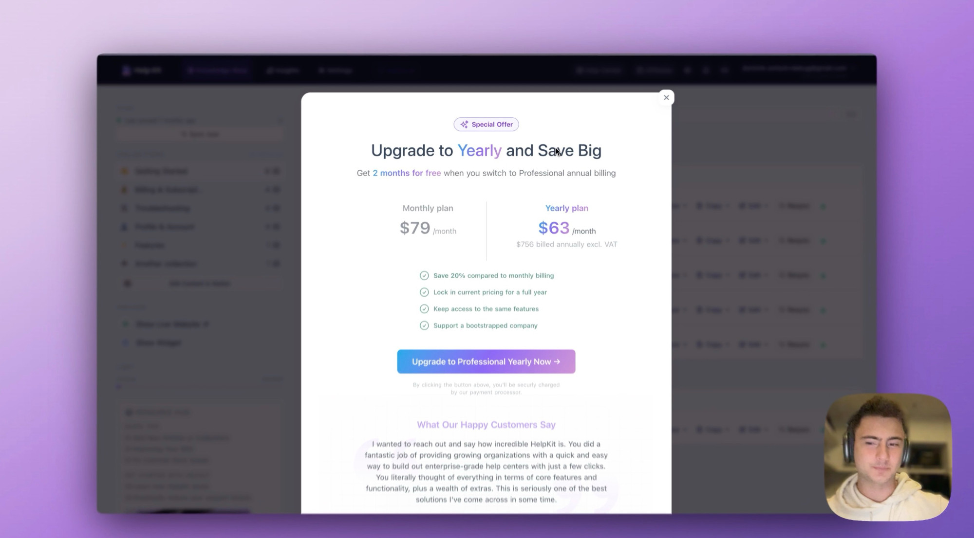
🚀 Just shipped an upgrade to the HelpKit annual plan nudge!
I realized the process of switching from monthly to annual could be way smoother. So, I improved the UX/UI:
✅ Clean design for clarity
✅ Fewer clicks for simplicity
✅ Clear savings display for better decisions
I realized the process of switching from monthly to annual could be way smoother. So, I improved the UX/UI:
✅ Clean design for clarity
✅ Fewer clicks for simplicity
✅ Clear savings display for better decisions
Comments
Have you considered adding a frame/badge around it "Popular Option", "Best Savings", or something similar?