Most pastel colors work with one another well so I could say they're 'safe' to pick whenever I need them, e.g. pastels yellow, pink, and blue works good together
Tones are good for adding textures so I put them as 'noise' in a flat fill—I also mix them with other hues, complementary or close to it
You can always use the 📌! Theres a feed u can use that will show the posts u comment the thumtack emote in 😁 its not the best solution, but its what we have atm.

Comments
I'm not really good at explaining stuff :/
Tones are good for adding textures so I put them as 'noise' in a flat fill—I also mix them with other hues, complementary or close to it
I pick colors on bright areas so I focus on tints—for base coloring and highlights
Then shades for sharp contrast against the tints whenever I want shadows or to emphasize the depth of an object
I usually pick one or two colours and then build it out of that depending on what looks nice together, so very different.
Thank for that palette too I'll have to give it a try.
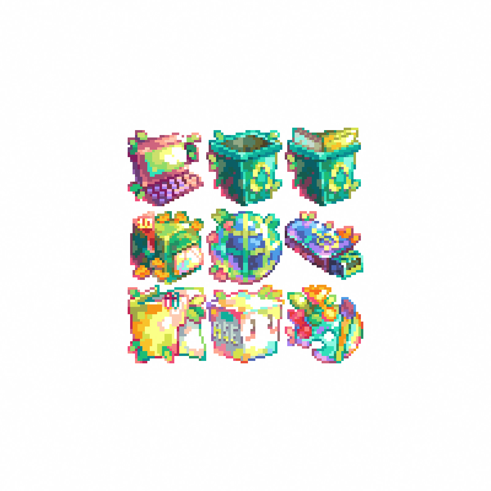
For this piece I used the Resurrect 64 palette
https://lospec.com/palette-list/resurrect-64
I recall that this is Resurrect 64 palette! the colors are very lovely 🥰
https://lospec.com/palette-list/resurrect-64