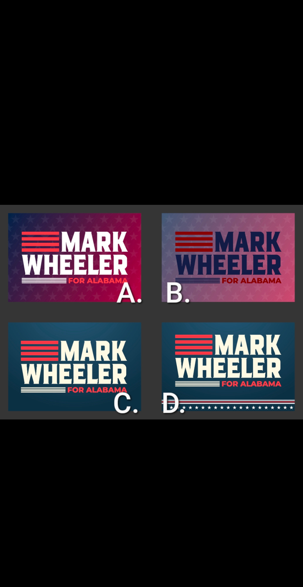
I like A and B, but they might be too flashy for your voters. D looks a little busy. So I'm gonna go with C as practical, to the point, and no fuss! Good luck with your campaign. I'm telling all the young people I know about you.
Opinions here.
Not A. Too Red.
B would be great for neighborhoods, slow traffic areas, parking lots.
C would be optimal for high speed traffic areas.
Not D as the bit at the bottom could be confused for words while moving.
Dear Mark, I love the style of D. Am I allowed to be honest? I hope. I dont care for the color scheme. Is it set? The colors are not as appealing online. To me. Love the graphics! Thx for asking.

Comments
Not A. Too Red.
B would be great for neighborhoods, slow traffic areas, parking lots.
C would be optimal for high speed traffic areas.
Not D as the bit at the bottom could be confused for words while moving.
Won't be able to see the other 2 while driving