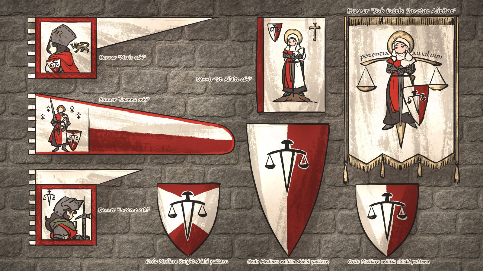
With the vertically split red/white/sword shields, the colour looks unbalanced. If the left side of the blade had colour, it might balance it better visually. Or it might not.
You're pretty good at designing banners, and patterns. 😉
One day AI will steal, and replicate your work. You'll receive zero credit for any of it. Just like the artists of old.
🤔😅
Yeah, banners, flags and such can be rather hard to look good when making a more complicated design. Studying and practicing patterns and banner designs will certainly help.
What you've already made looks pretty nice, even if the colors look a bit off.
Wargaming nerd here. I never thought of using a picture on a banner like the ones on the left.
The shields on the right are so good as heradry.
The hanging banners are always nice to see peoples takes on them.
I really enjoy your art, but this one is especially inspiring for me.

Comments
One day AI will steal, and replicate your work. You'll receive zero credit for any of it. Just like the artists of old.
🤔😅
What you've already made looks pretty nice, even if the colors look a bit off.
The shields on the right are so good as heradry.
The hanging banners are always nice to see peoples takes on them.
I really enjoy your art, but this one is especially inspiring for me.
Sub tutela Sancte Aileitae. They look like they could be based on actual medieval banners.