I mean no hate to World, I promise, but this is one of those things that lets you see very easily where Monster Hunter started to take itself a little too seriously. Even RiseBreak and all of its batshittery has a more subdued logo.
(This is a consequence of things like corporate minimalism as well but the left turn in direction can be felt in lots of overt and subtle ways. Still hyped for Wilds though, for the most part it's genuinely embracing what makes MonHun cool.)
I actually really like how ornamental the Wilds logo is. Clearly lacking the chaos and energy of the previous era but at least has something. Rise and especially World are a bit snoozeville
Or the absolute tragedy of the super cool energetic fun logo with a rathalos and stuff incorporated into the font Monster Hunter Stories had to boring plain World style font Monster Hunter Stories 2 had
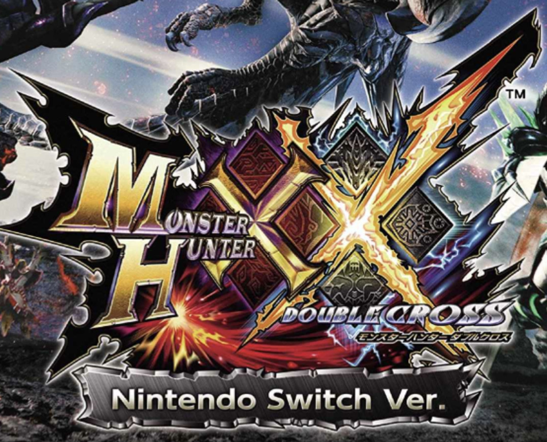
Especially fascinating considering the path from X (Generations) to its updated release XX (Generations Ultimate). X is still fairly energetic but within the conventions of the PS2-3DS era.
XX feels like such an endcap to this era by just going balls to the wall

Comments
XX feels like such an endcap to this era by just going balls to the wall