ThreadSky
About ThreadSky
Log In
devseb.co
•
129 days ago
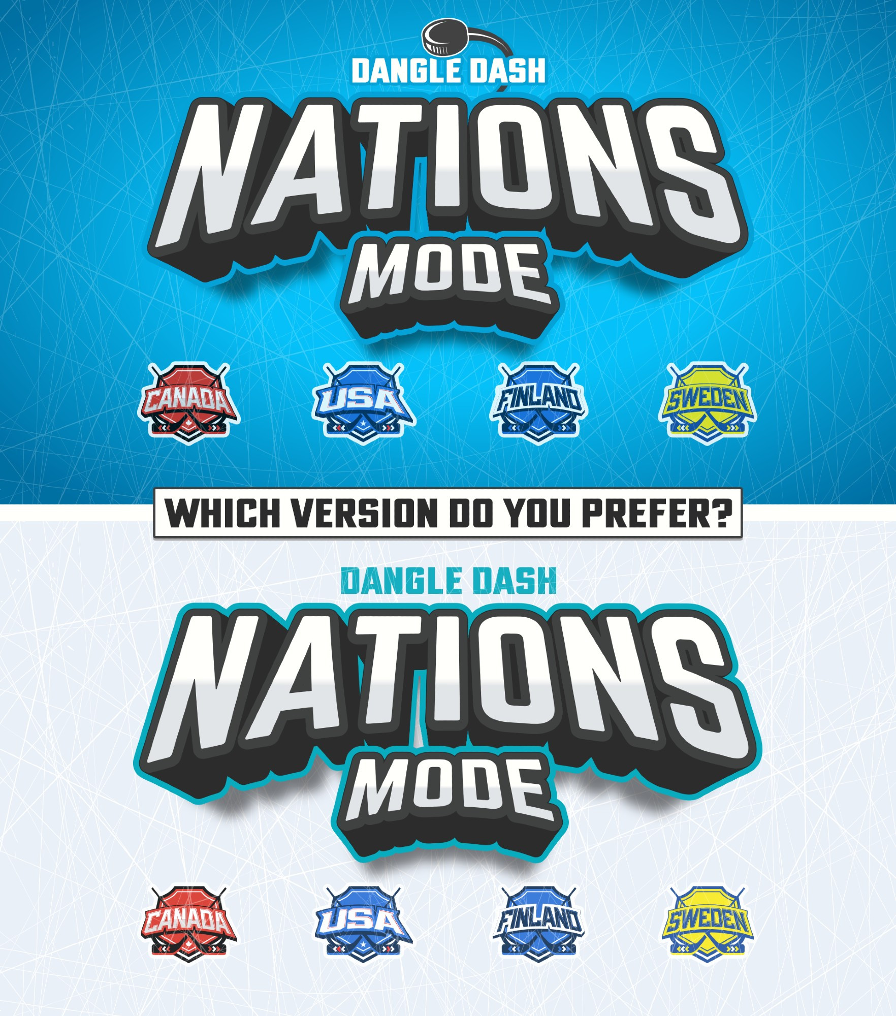
Which version do you prefer? Top or bottom? #gamedev #design #graphicdesign
Comments
Log in
with your Bluesky account to leave a comment
[–]
colbygamedev.bsky.social
•
129 days ago
Top, it shows the ice cuts more and the borders on the logos. Both look slick though!
1
reply
[–]
rottengums.bsky.social
•
129 days ago
Top - it makes the title pop.
1
1
reply
[–]
devseb.co
•
129 days ago
I think so too
0
reply
[–]
raccoonden.io
•
129 days ago
I think I like the top one more
1
1
reply
[–]
devseb.co
•
129 days ago
Thanks for the feedback!
0
reply
[–]
echoinavoid.bsky.social
•
129 days ago
The blue one
1
reply
[–]
rodrigosoria.bsky.social
•
129 days ago
Top 100%!
I saw your pictures and even if the floor is white, to represent things related to "ice" or "chill" in posters like these, the colors of the top one fit better.
Wish you the best!
1
1
reply
[–]
devseb.co
•
129 days ago
Thanks for the feedback! I agree—while the white does represent the ice effectively, it doesn’t make the logo stand out as much.
0
reply
Posting Rules
Be respectful to others
No spam or self-promotion
Stay on topic
Follow Bluesky's terms of service
×
Reply
Post Reply

Comments
I saw your pictures and even if the floor is white, to represent things related to "ice" or "chill" in posters like these, the colors of the top one fit better.
Wish you the best!