
First I just wanted to caption this picture: UX vs UI.
But there’s more to it - read on… 👇
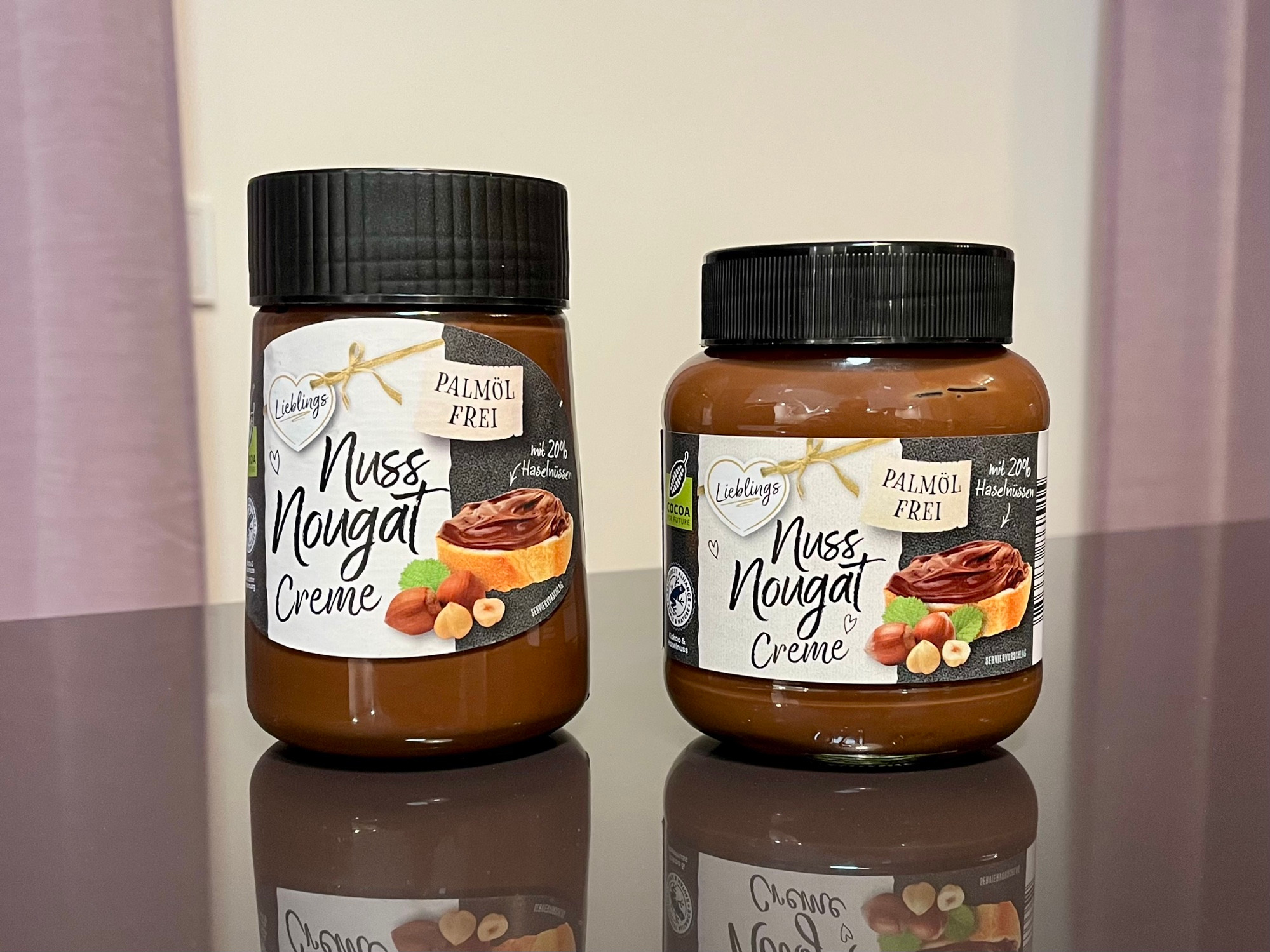
We usually buy this local-ish brand of chocolate spread (wo/ palm oil). The one on the right is how it looks, or rather has looked for the last years.
Does the shape of the jar remind you of something?
1/4
But there’s more to it - read on… 👇
We usually buy this local-ish brand of chocolate spread (wo/ palm oil). The one on the right is how it looks, or rather has looked for the last years.
Does the shape of the jar remind you of something?
1/4
Comments
In short, it’s at least partially an attempt of transferring a feeling of brand recognition and a certain amount of similarity to a competing product.
2/4
What’s not so great about the jar? It’s hard to get as much of its content out as possible due to the curved top area.
When I went shopping recently, I saw the new shape of the jar (left)
3/4
They’re moving away from the attempted brand recognition and towards a better user experience.
The new shape of the jar will be much easier to use on a daily basis - and it will be much easier to fully empty it.
So, not exactly UX vs UI but rather UX over brand recognition. 😅
4/4