
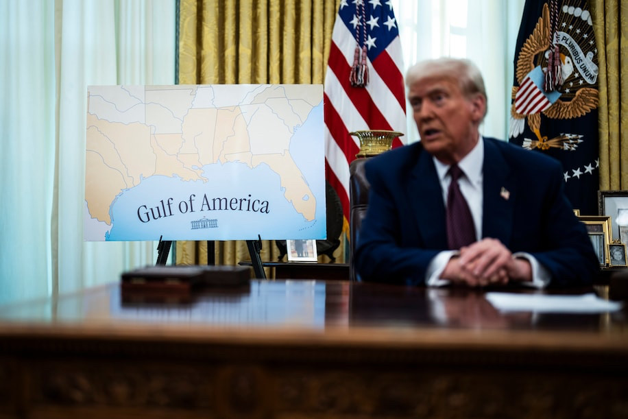
can we talk about the shitty "Gulf of America" map?
https://www.washingtonpost.com/wp-apps/imrs.php?src=https://arc-anglerfish-washpost-prod-washpost.s3.amazonaws.com/public/PJGRBNPF2C6LKF72GS6KJBGFOU_size-normalized.jpg&w=916
https://www.washingtonpost.com/wp-apps/imrs.php?src=https://arc-anglerfish-washpost-prod-washpost.s3.amazonaws.com/public/PJGRBNPF2C6LKF72GS6KJBGFOU_size-normalized.jpg&w=916
Comments
1. WTF is going on with the multi colored states in graduated shades of tan to orange.... oh wait, I know why!
2. Rivers are nearly indistinguishable from the state boundaries... which, giving the benefit of the doubt, makes the above choice in #1 make sense, but it is a bad combo.
3. Why have the rivers at all? The state boundaries could be thicker than rivers to differentiate, and also a light color to minimize elision with rivers.
4. The centering of the map is odd. It demonstrates that "Gulf formerly known as Mexico" only pertains to the US' EEZ, not that of MX?
5. Nitpicking here, but with this bounding box, I'm wondering if Tennessee & Oklahoma are actually shaped like that where they're clipped.
6. The label font choice is gawdy, the font size far too large and bold. It is oddly angled, even accounting for the curved font placement.
7. The WH seal is also similarly angled. Why? Why have the WH seal? Bc, it is the only "institution" which thinks this is a good idea?
8. Recommendations:
a. use natural earth data
b. get a new cartographer