ThreadSky
About ThreadSky
Log In
robyeodesign.com
•
10 days ago
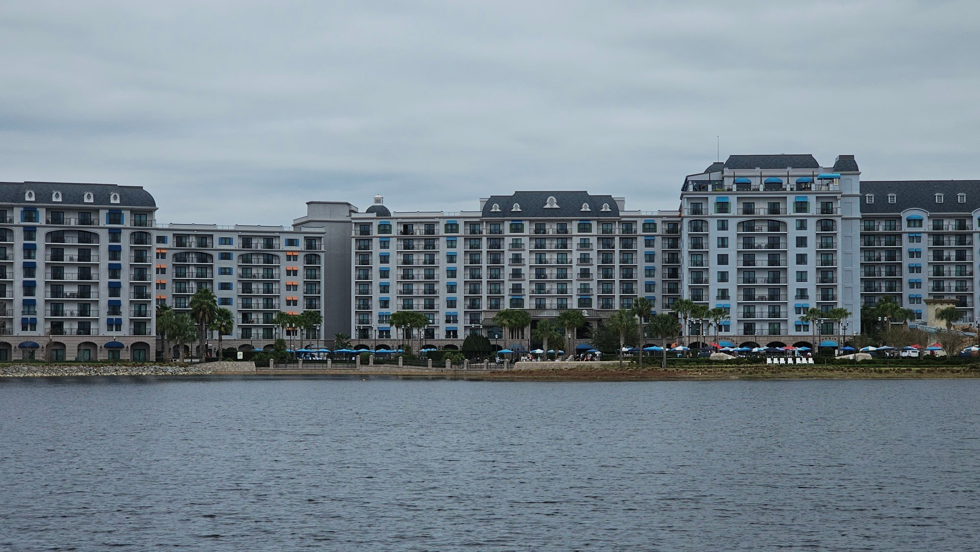
It's very pretty on the inside, but I'm not sure about the grey colour scheme on the outside. John Hench would have thrown his cravatte at it
Comments
Log in
with your Bluesky account to leave a comment
[–]
horizons1983.bsky.social
•
10 days ago
I wasn’t expecting to love it as much as I did. Just a great vibe for me
1
1
reply
[–]
robyeodesign.com
•
10 days ago
It's a lot nicer when you're inside or close to it, it just doesn't look great as a whole, especially across the lake.
1
reply
[–]
imaginerding.com
•
10 days ago
I was shocked by the box-iness of the structure. It’s almost like this DVC resort was the antitheming hotel. The gray hole of theme.
1
2
reply
[–]
robyeodesign.com
•
10 days ago
Yeah, you can tell it's a default building with some theming added on afterwards, rather than being a themed design.
0
1
reply
[–]
imaginerding.com
•
10 days ago
Too bad they didn’t up up down down left right left right the building. I also agree that Hench would have murderized somebody.
1
reply
[–]
thechrisglass.bsky.social
•
10 days ago
I just wish the lobby was grander. Outside of that, I liked it.
1
reply
[–]
wallyboag.dissky.com
•
10 days ago
The difference between this building and Portofino Bay just up the freeway is jarring.
0
reply
[–]
teambercase.bsky.social
•
10 days ago
To me, it feels very "corporate expense account"
0
reply
[–]
parksguy.bsky.social
•
10 days ago
The striking thing to me was the lack of a big entry/lobby similar to the other Deluxe & DVC resorts.
0
reply
[–]
loudgayamerica.bsky.social
•
10 days ago
It’s so jarring next to Caribbean Beach. No visual barrier or transition at all.
0
reply
Posting Rules
Be respectful to others
No spam or self-promotion
Stay on topic
Follow Bluesky's terms of service
×
Reply
Post Reply

Comments