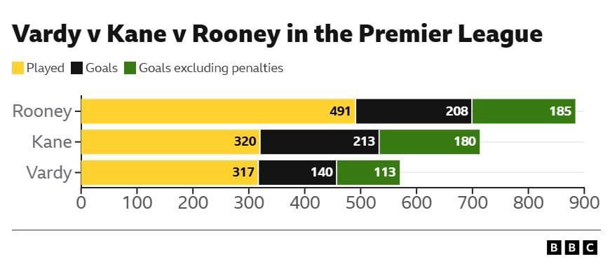
Why you would accumulate appearances with goals and goals minus pens into a chart I do not know?! It’s a complete mess. What if we put James Milner and Gareth Barry alongside them?
Because of some of the information or because the graphic adds them up as if it is somehow a longer number with sections in it rather then the three bars underneath each other per player, rather than stacked?
We should make an official competition for The Worst Football Data Visualisation of the Year. This would surely win it this year, or at the very least get a podium finish.
This is clearly a weighted scoring system that accounts and rewards both for gameplay prowess *and* the working-man attitude of turning in the appearance even when you’re not at your best. It’s visionary.
Everyone is rightly dunking on that chart but this one is actually kind of interesting. How did Ronaldo score 36% more penalties in just 11% more games? I assume both were almost always dedicated takers and had similar conversion rate.

Comments
🤣
* 441 appearances
* 260 goals
* 204 non-penalty goals
* 609 apps
* 177 goals
* 134 non-penalty goals
Also, psst don’t pass to Vardy!
Finally there's proof
The chart is a headfuck. Just a terrible way to display that data. Funny though