
🚨unpopular opinion: Calibri s*cks
...and serif fonts are not so bad🫣
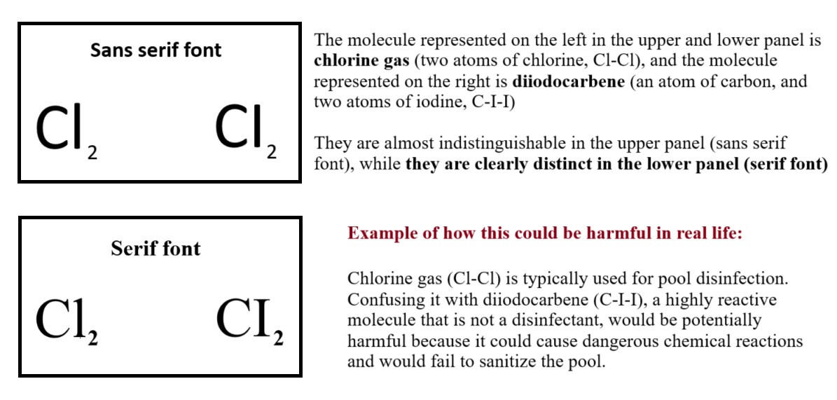
Serif fonts are often discouraged because their strokes can be distracting. But after all, good communication should be unambiguous and sans serif fonts can lead to chemical misunderstandings (see pic)
🔗 https://rdcu.be/d5n72
#SciComm
...and serif fonts are not so bad🫣
Serif fonts are often discouraged because their strokes can be distracting. But after all, good communication should be unambiguous and sans serif fonts can lead to chemical misunderstandings (see pic)
🔗 https://rdcu.be/d5n72
#SciComm
Comments
#typography #readability #legibility #uxdesign
https://www.brailleinstitute.org/freefont/
Image shows the number 1, a capital then lower case letter i, then a lowercase L, which all look identical in many fonts.
It seems... unlikely...
I learned this little tidbit 55 years ago when I was the editor of my high school paper.