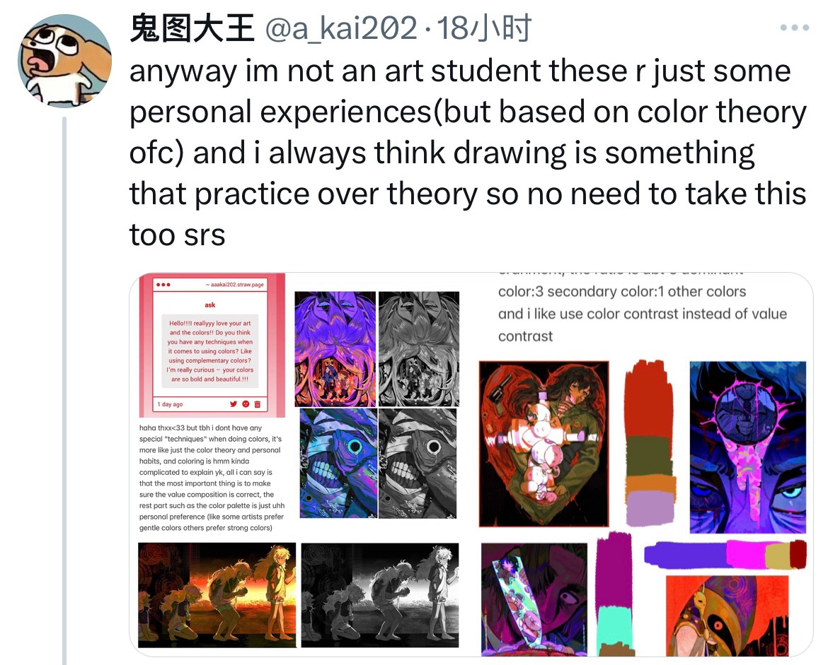
That first part about value composition is so right! Our eyes are generally engineered to detect contrast better than color, so making sure there's good contrast is better than accurate color
🤝🏻exactly! when many beginners first start doing colours (including me) they usually tend to put every kind of color in one art to make it look "colorful" but in fact simple colours (like 2-3 kinds) can also look good if the value composition is correct

Comments