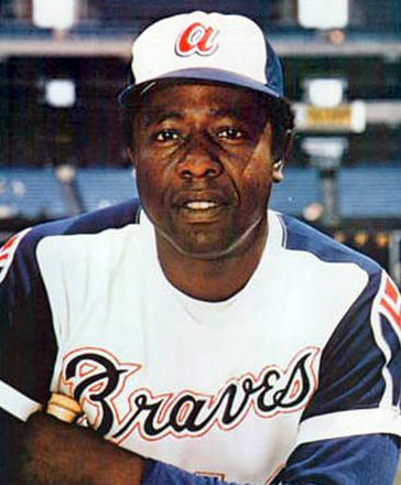
1970s #MLB hats #PolyesterRankings #7: The #Braves 1972 rebrand brought brighter (America's team?) colors, groovy fonts, and one of the most '70s hat logos... the "lower case a." And it really pops against the white front on the blue hat.
1 / 2

Comments