ThreadSky
About ThreadSky
Log In
fpl.page
•
8 days ago
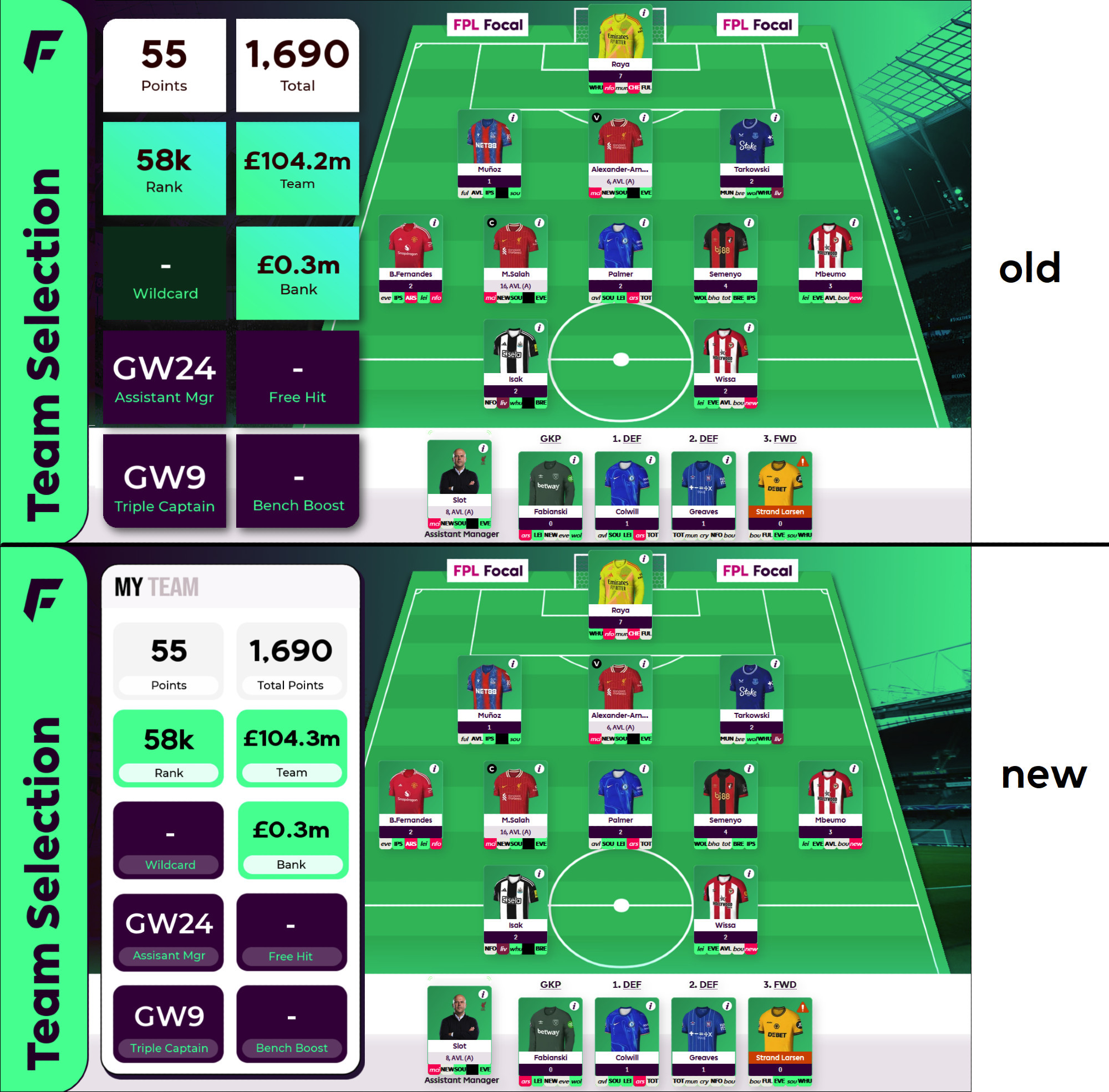
Thoughts on this redesign?
Comments
Log in
with your Bluesky account to leave a comment
[–]
bozza15.bsky.social
•
7 days ago
I just think the Points and Total Points needs a different back ground colour as clashes a lot with the white otherwise looks all good!
0
reply
[–]
arn99.bsky.social
•
7 days ago
Cleaner look to it
0
reply
[–]
fplcrusader.bsky.social
•
8 days ago
I actually prefer the old one, easier to follow
5
1
reply
[–]
fpl-saint.bsky.social
•
8 days ago
Agree. I think original is a bit less busy
3
reply
[–]
simon-f92.bsky.social
•
8 days ago
I like it. Visually more appealing, somehow clearer
1
reply
[–]
fplgolfkeeper.bsky.social
•
8 days ago
Yeah a bit clearer on the white background but nothing wrong with the old design tbh
1
reply
[–]
fplchessplayer.bsky.social
•
8 days ago
I like it, seems like there’s love for both though. Can you offer both on the site and allow people to choose?
0
reply
[–]
fpl.page
•
7 days ago
Landed on this in the end, thanks for the feedback. Probs not done tweaking it 😅
3
2
reply
[–]
bozza15.bsky.social
•
7 days ago
We’ll be watching regardless Oscar! Don’t overthink it too much 🤣
0
reply
[–]
vskrinis.bsky.social
•
7 days ago
W
0
reply
[–]
hoopdreams9.bsky.social
•
8 days ago
Looks crisp mate.
0
reply
[–]
fplshackleton.bsky.social
•
8 days ago
Old one is cleaner
0
reply
[–]
marccpb.bsky.social
•
8 days ago
Agreed, old one is easier to view.
0
reply
[–]
deweyarsenal.bsky.social
•
8 days ago
An improvement 👍🏻
1
reply
[–]
fisherman111.bsky.social
•
7 days ago
The old one looks a little cleaner
0
reply
[–]
fplwhufc.bsky.social
•
8 days ago
New 👍
0
reply
Posting Rules
Be respectful to others
No spam or self-promotion
Stay on topic
Follow Bluesky's terms of service
×
Reply
Post Reply

Comments