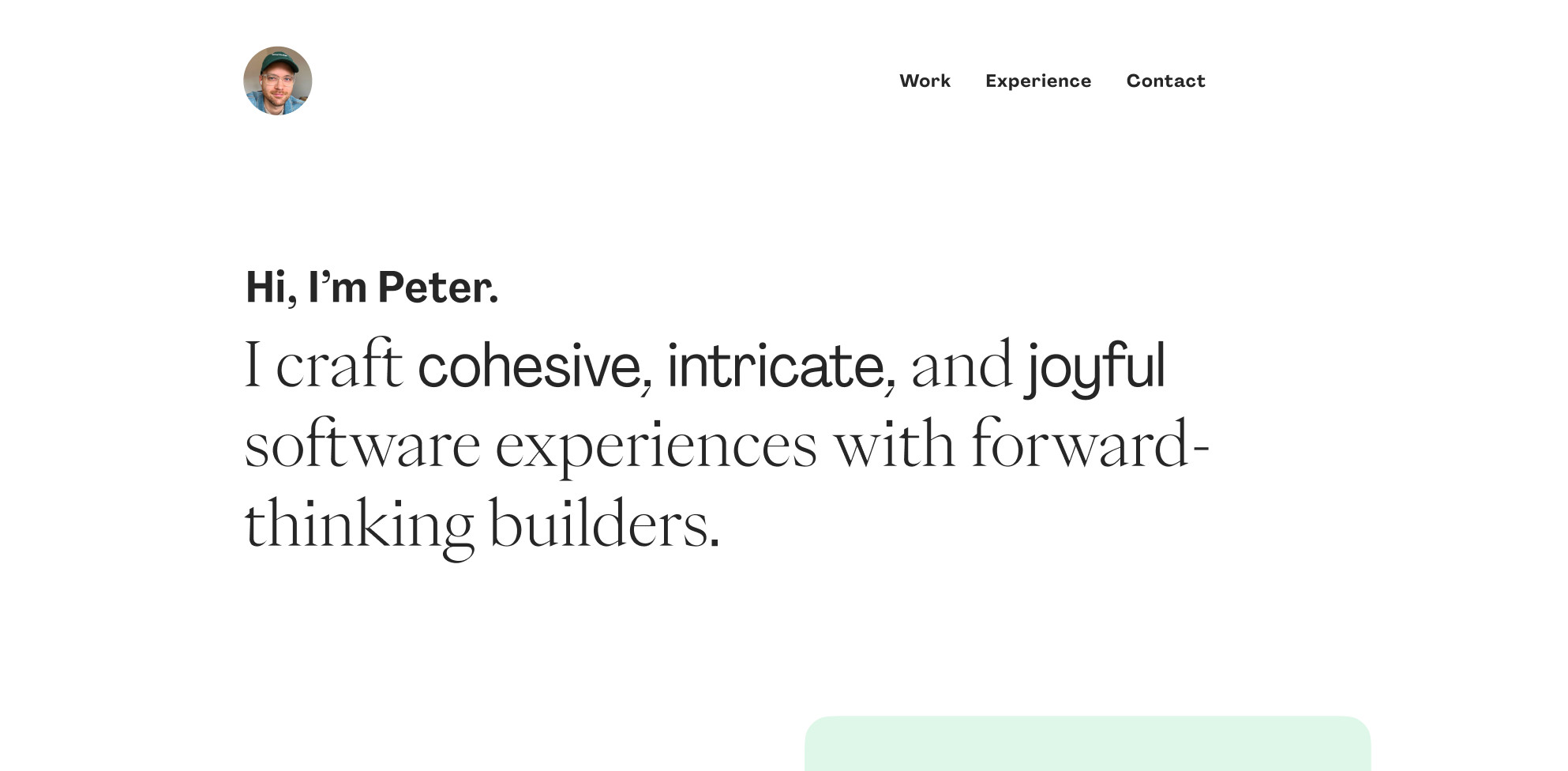
oh no i'm redesigning my website again (again[again{again}]) how we feeling about the typography #designsky? (special thanks to Pangram Pangram, one of my favorite foundries)
Comments
Log in with your Bluesky account to leave a comment
there’s something off about combining serif with sans-serif in the same sentence and even line. Regardless of style, both fonts have slightly different x height and that’s visually bothering, IMO.
Yeah I was gonna dial in that x-height but maybe it’s not working. I’ve seen it done well but maybe it needs a bit more contrast to work, like a bit more weight.
When I was in design school our type teacher would say, if it is large, does it need to be bold? I am thinking ab this every time I think ab making something bold.

Comments