ThreadSky
About ThreadSky
Log In
dame.is
•
7 days ago
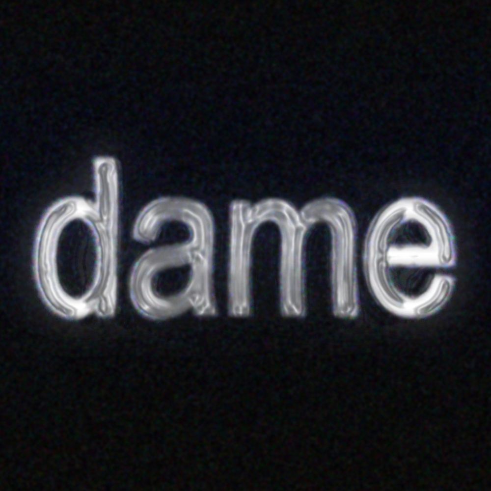
with zero context whatsoever, which of these 4 typefaces do you like the most?
⚫⚪🟣🟠
Comments
Log in
with your Bluesky account to leave a comment
[–]
flicknow.xyz
•
7 days ago
im very normie and like top right, but bottom left reminds me of spongebob which may or may not be a good thing
2
reply
[–]
enflux.bsky.social
•
7 days ago
orange bkgd is the prettiest but i wouldn't want to read long passages in it. good for like a website subheading
white is the most readable digitally, black would probably print best. purple is fun but for even shorter amounts of text than orange
0
reply
[–]
dblcliq.bsky.social
•
7 days ago
The two on the right are the least distracting (orange & white)
1
reply
[–]
skyb.me
•
7 days ago
🟣 but I would very much need to know the context before choosing for real.
2
reply
[–]
hesjustphill.bsky.social
•
7 days ago
I like top right a lot and bottom right but it really depends on the use case to decide between those two haha
0
reply
[–]
quasimatt.com
•
7 days ago
⚪️
3
reply
[–]
dunkirk.sh
•
7 days ago
@dame.is 🟣 and 🟠 are nice
1
reply
[–]
imlunahey.com
•
6 days ago
top right.
1
reply
[–]
dame.is
•
7 days ago
i'm probably just gonna end up using times new roman or arial lol
7
reply
[–]
alilleybrinker.com
•
7 days ago
⚫️
1
reply
[–]
lulrngdomain.172749018.xyz
•
7 days ago
⚫
1
reply
[–]
alt.psingletary.com
•
7 days ago
1. black on white
2. dark purple on lavender
pass on the other two becasue too much going on
3
reply
[–]
nocab.lol
•
7 days ago
the first one, but i guess i'm a bit boring when it comes to font preferences lol
2
1
reply
[–]
nocab.lol
•
7 days ago
shit i didn't see the emojis, ⚫️
2
reply
[–]
davenash.com
•
7 days ago
⚫️
2
reply
[–]
trashhdotjpg.bsky.social
•
7 days ago
Black or white. Depending on context, purple is okay. I HATE the orange though.
0
reply
[–]
metaflame.dev
•
6 days ago
I prefer the white one out of these four (I also think I slightly tend towards monospace in general)
2
reply
[–]
julia.cool
•
6 days ago
it’s impossible to say without context! like 🟣 is fine for a birthday party but not ok on a letterhead
1
1
reply
[–]
julia.cool
•
6 days ago
but ⚪️ is my least favorite
1
reply
[–]
symm.social
•
6 days ago
⚪ is my personal favorite of the bunch. It's clean & attractive & modern. Good for most applications. The rest are very busy. But again, depending on the context, it may work in each case.
2
1
reply
[–]
symm.social
•
6 days ago
⚫ says literary, educational, editorial, thoughtful, brooding.
⚪ says clean, modern, inoffensive, plain, streamlined.
🟣 says fun & playful, silly, joyful, goofy.
🟠 says historical, fantastical, magical, adventurous, epic.
2
reply
Posting Rules
Be respectful to others
No spam or self-promotion
Stay on topic
Follow Bluesky's terms of service
×
Reply
Post Reply
Comments
white is the most readable digitally, black would probably print best. purple is fun but for even shorter amounts of text than orange
2. dark purple on lavender
pass on the other two becasue too much going on
⚪ says clean, modern, inoffensive, plain, streamlined.
🟣 says fun & playful, silly, joyful, goofy.
🟠 says historical, fantastical, magical, adventurous, epic.