
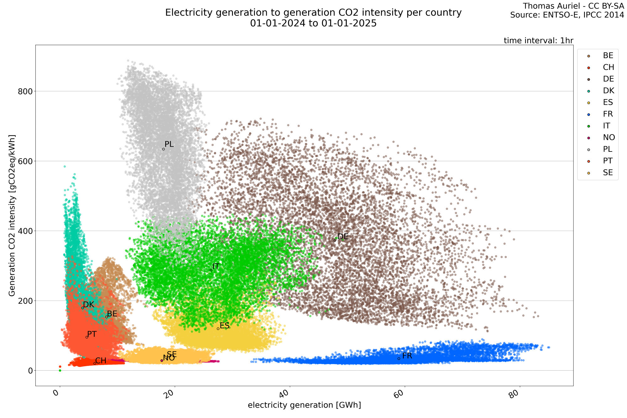
I'm please to announce that i published the now famous scatter graph : Comparison between the electricity generation and CO2 intensity per countries in Europe.
http://thomasprojects.net/BotElectricity_2024/
http://thomasprojects.net/BotElectricity_2024/
Comments
https://m-transparency.entsoe.eu/
...je l'ai peut-être déjà dit les années précédentes sur un autre réseau 😏
Effectivement pas terrible mais j'ai vu ce que je voulais voir: belle perf du Portugal en 10 ans.
La Pologne bouge bien aussi même si ça reste haut, elle sera bientôt au niveau de l'Allemagne qui est censée "être ailleurs dans 5 ans"...
Ce serait aussi plus joli avec des échelles fixes 😉
Changement de l'intensité carbone retenue pour le charbon ?
Il faut que je les mette a jour de mon côté. Elles commencent à etre datés (certaines remontent à IPCC 2014)
Mais je peux les réintégrer maintenant.
You will also find several other plots on the website from the years 2015 to 2024.
France exported about 67.3 TWh (accumulated), which is a high export level!
I will detail these changes later and explain what they imply for the European grid.
https://fr.wikipedia.org/wiki/Celtic_Interconnector
The export price is a market price, fixed hour by hour for what I know, I don’t know by who.