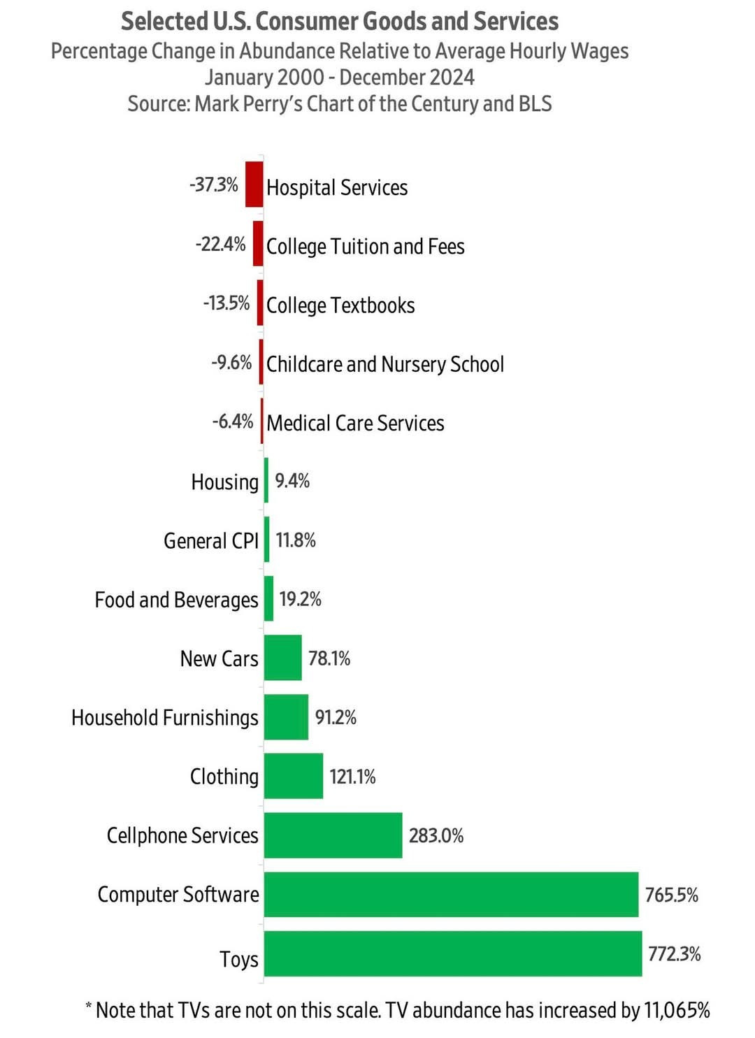
The economist Mark Perry regularly publishes a chart illustrating how the nominal prices of US goods and services have changed.
We have compared each product to the change in average hourly wages to calculate the change in abundance.
Read more: https://humanprogress.org/time-pricing-and-mark-perrys-chart-of-the-century/
We have compared each product to the change in average hourly wages to calculate the change in abundance.
Read more: https://humanprogress.org/time-pricing-and-mark-perrys-chart-of-the-century/

Comments
https://docs.google.com/document/d/13KF_PPtNI_KOWR-CzP8_o-NjkyCjg9TzzxPkbXR1DwM/edit?usp=sharing
We really need to be sounding the alarms now!!! No more worrying about hurt feelings or disagreements. Our very existence is at stake here!!!!!!!!!!