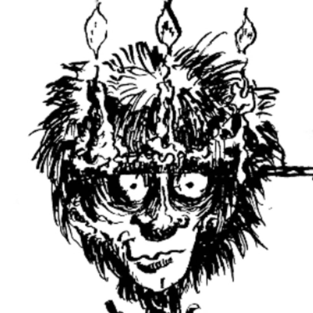
I just feel like it's still too "messy" and not crisp enough. I want to avoid cross hatching and dot work as it blends in too much with other adventure maps but identity is hard.
Comments
Log in with your Bluesky account to leave a comment
I assumed the messy was the point. It has an feel of brush and ink, or really wet woodblock stamping to it. It does indeed seem distinct.
Depending on the adventure context, this could be perfect. If it visually tells the story, 👍
My only personal thought was "why features not aligned with grid?"
Comments
Depending on the adventure context, this could be perfect. If it visually tells the story, 👍
My only personal thought was "why features not aligned with grid?"