
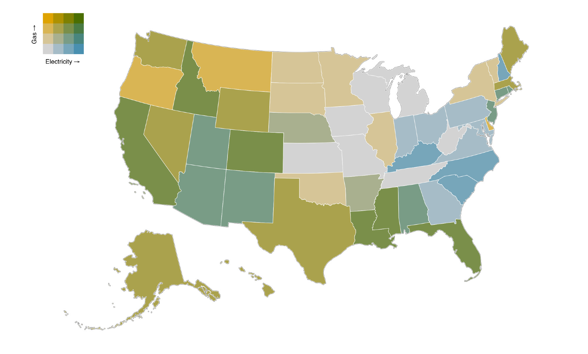
Spent much of the day making this bivariate map of gas/ electricity and capacity / consumption from 2010-2023. Colors show where the annual peak is growing faster than annual consumption, i.e. where peak growth > energy growth, but map doesn't show negative numbers well. Too complicated.
Comments
I’m surprised to see PA as one axis positive, in the electric dept, but I guess natural gas fired peakers, solar, and wind have been spreading across the state faster than consumption.