Is there an advantage to using this method over using a representation such as proportional dots? Where the size of the dot represents the population in the area and the color represents the unemployment rate?
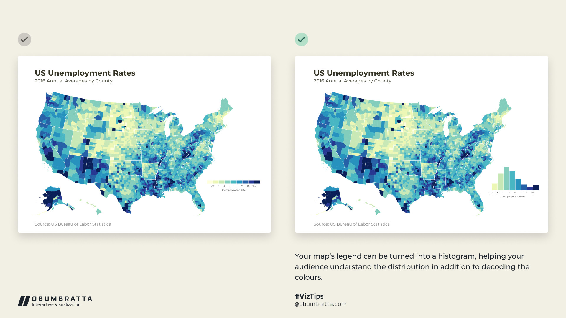
A similar approach I am very fond of is using a companion bar chart.
I've found that maps are often not the best way to communicate info. Nonetheless, users *like* them: I think maps ground data and this helps people. So, I think it's good to use them, but enhance them.

Comments
https://www.rayshader.com/
https://bsky.app/profile/teunbrand.bsky.social/post/3lihsstn7ec2g
Thanks
https://observablehq.com/@gitjeff05/state-choropleth-with-histogram-legend
Also: ARC-GIS, python or R?
As for software - Observable or D3 (I can't remember) for the map and excel for the bar chart and Figma to combine them.
https://bsky.app/profile/andrew.heiss.phd/post/3likkrzhfc224
I've found that maps are often not the best way to communicate info. Nonetheless, users *like* them: I think maps ground data and this helps people. So, I think it's good to use them, but enhance them.
I always provide table of data beneath my maps, which isn't as visually appealing as this :)