
Guys, need your help with CSS/Tailwind.
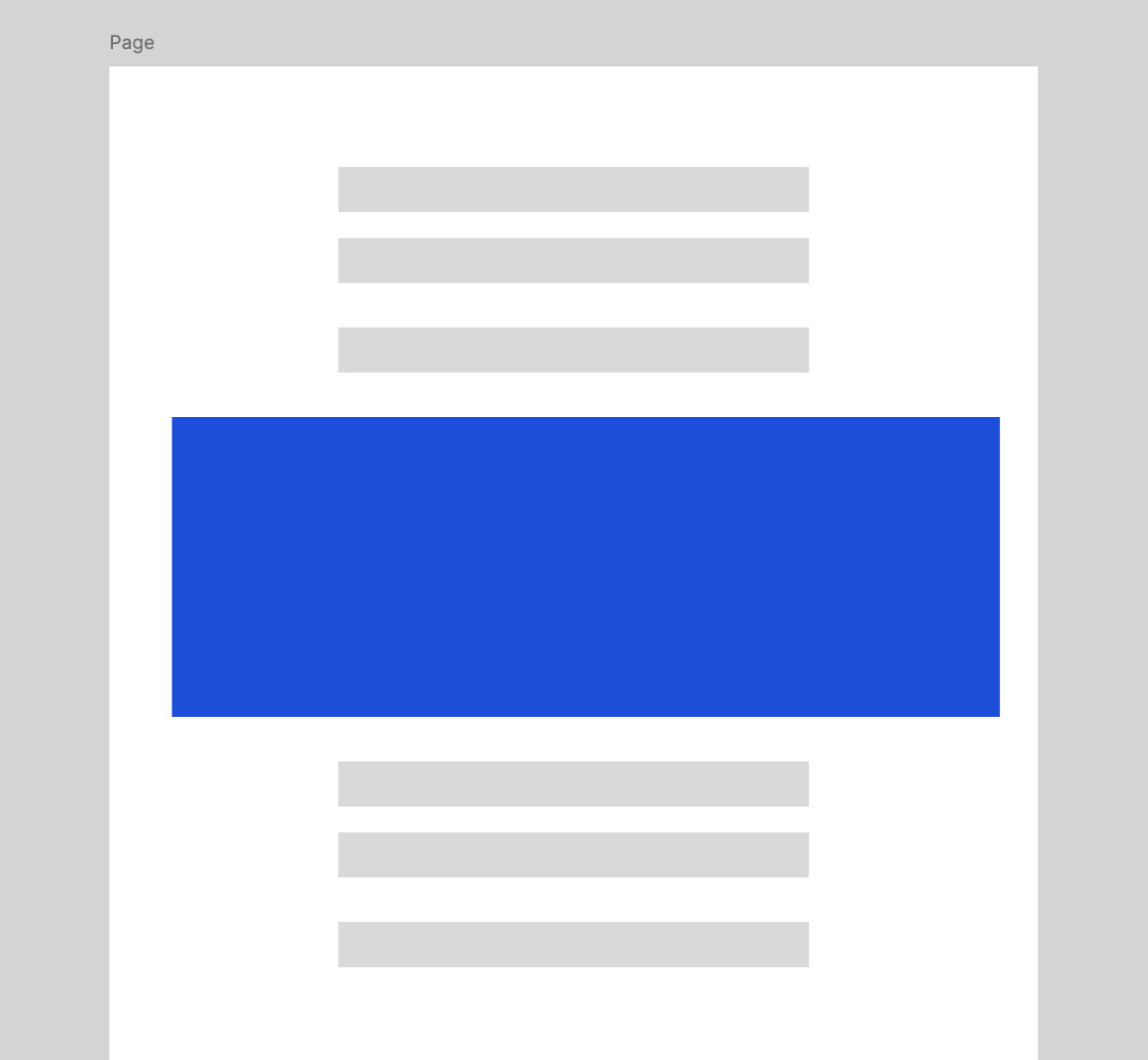
I have container and limited it to max-w-3xl, so that the text don't stretch and easy to read.
But for some elements, I need to go beyond the container, e.g. for images. They should take full width, yet still constrained to the main parent container
I have container and limited it to max-w-3xl, so that the text don't stretch and easy to read.
But for some elements, I need to go beyond the container, e.g. for images. They should take full width, yet still constrained to the main parent container
Comments
imagine these are my classes, it doesn't actually matter whether it's tailwind or css.
same thing. I don't like wrapping typography elements every time .
Looks like I should put constrains for each element e.g.
p { max-width... }, ul { max-width ... }
https://youtu.be/Bm0vjEsaPw0?si=gO7MLTStnLEMlxkB
Yeah, I can see, 100%. I chose this approach but the problem is that I know nothing about grids :D It works, but the code is a bit clumsy.
Or make some classes global.
But anyway, this is cool
Thank you for the video!
But it's inconvenient, especially in Nuxt Content MDC files.
,
etc) ?
And don't touch other elements, so that they will stretch up to the container width?
But likely need to set this using `@apply` in CSS
https://frontendmasters.com/blog/full-bleed-layout-with-modern-css/
I am working on a new personal page at the moment and deliberately try to learn as much as I can about new styling methods.
Really a lot of things
text-wrap: pretty, text-rendering: optimizelegibility etc...
I still haven't used variables and other things 😱
I tried this approach, seems fine to me
https://www.joshwcomeau.com/css/full-bleed/
but I'll read your article too. I completely abandoned modern CSS, need to catch up with it
The page layout was based on:
https://www.joshwcomeau.com/css/full-bleed 🙇🏻♂️