ThreadSky
About ThreadSky
Log In
myloveless.bsky.social
•
124 days ago
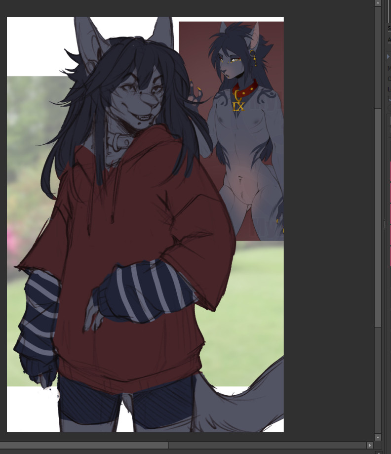
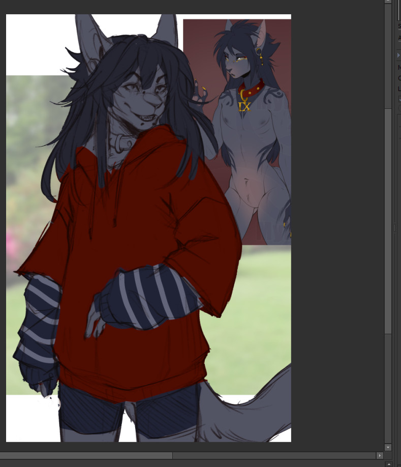
Which one looks nicer, desaturated red or more saturated?
1 / 2
Comments
Log in
with your Bluesky account to leave a comment
[–]
lightningsl.bsky.social
•
124 days ago
Depends on the goal really, but the second one really pops if your intent is to pull focus forward 👌
1
1
reply
[–]
myloveless.bsky.social
•
124 days ago
Ohh I can see that~! Thank you for the insight!
1
reply
[–]
stormychang.bsky.social
•
124 days ago
Hm. Desaturated looks over-washed and cozy. Saturated looks more new/flashy. So maybe whatever fits the vibe you want?
1
1
reply
[–]
myloveless.bsky.social
•
124 days ago
It does have that, I love this sweater feel for the first one. Makes me wanna lean just for that. xD
0
reply
[–]
apoxalypsisart.bsky.social
•
123 days ago
1
0
reply
[–]
nervengiften.bsky.social
•
123 days ago
Personally I like the desaturated more, then again I am colours blind and it makes it a little harder for me. They both are good picks though. Cute as a button by the way.
1
reply
[–]
dykumanasir.space
•
124 days ago
More saturated makes the rest look washed out TBH
1
1
reply
[–]
myloveless.bsky.social
•
124 days ago
Ooh awesome to hear that, I am red-ish blind so this is super helpful to me!
1
reply
[–]
lukurio.bsky.social
•
124 days ago
both are good but I like the muted tones!
1
1
reply
[–]
myloveless.bsky.social
•
124 days ago
Thank you~ Yeah I might lean that way. AHH decisions are hard.
0
reply
[–]
takodavega.bsky.social
•
124 days ago
PERSONAL TAKE: depends on your background choice.
I like the one on the right because the red matches his collar.
But if you're doing something like fall themed the muted tones on the left would work well!
2
1
reply
[–]
myloveless.bsky.social
•
124 days ago
The background is the light greenish color in the piece behind him. x3 But, yeah! It would match his collar really well~.
1
reply
[–]
vesperalexier.bsky.social
•
123 days ago
Desaturated seems to blend nicely with the other colors as of right now.
1
reply
[–]
raescreams.bsky.social
•
124 days ago
Desaturated fsure
1
1
reply
[–]
myloveless.bsky.social
•
124 days ago
Seems to be the fave so far!
1
reply
Posting Rules
Be respectful to others
No spam or self-promotion
Stay on topic
Follow Bluesky's terms of service
×
Reply
Post Reply
Comments
I like the one on the right because the red matches his collar.
But if you're doing something like fall themed the muted tones on the left would work well!