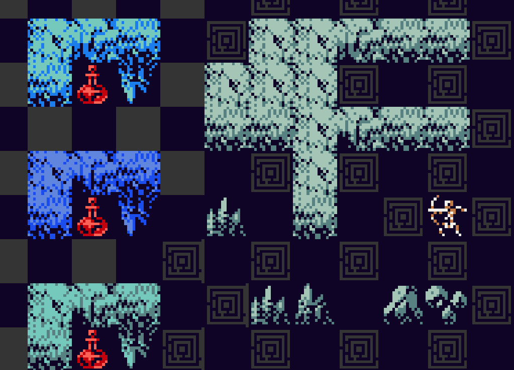
working on this stone tileset more. i like it, especially in blue or the lower left blue-grey palette, lower left. the third tile (shadowed left end) isn't quite done, but i like the toothed crevice along the seam.
Comments
Log in with your Bluesky account to leave a comment
thank you! that's really what i'm going for, i want it to be ambiguous that you're still /imagining/ as much as looking, but to be very substantial in terms of materiality.
Hard to say without seeing it mocked up fully in context and at scale, but I wouldn't think so. Especially if the navigable tiles are super dark like that, I think it'd read well. Super "grunchy" (gritty, grimy, crunchy).
thank you! yeah i tried to calibrate for that use case, but feel like there will be a lot i will learn once i actually implement the sprite mode! context is so informative.
If both navigable and non-navigable tiles could have similar values, I'd try to exercise iron control over hue (for example, cool colors for walls, warm colors for floors). That's my knee jerk response, at least.
Yeah, I've learned to mostly ignore my intuition for stuff like that until I actually see it, haha. I'd love to see what it looks like once sprites are in.

Comments
https://patreon.com/vacuumflowers
for context, they're for a roguelike where you're usually only seeing a 1 thick wall. example: