ThreadSky
About ThreadSky
Log In
jasonginsburg.bsky.social
•
35 days ago
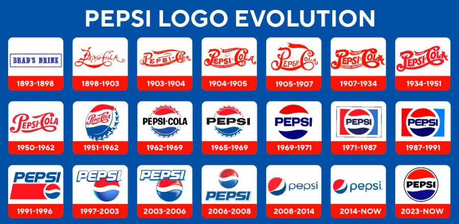
Evolution of the Pepsi logo.
#graphicdesign
Comments
Log in
with your Bluesky account to leave a comment
[–]
natwoodward.bsky.social
•
32 days ago
Every logo designer since 1962 should be embarrassed to take money for their logo evolutions. Worst of all is the 2008 redesign that took the Pepsi icon and turned it into a plumber's butt (red shirt, blue pants)
1
1
reply
[–]
jasonginsburg.bsky.social
•
31 days ago
I hated when they went to that weird off-center, asymmetrical logo in 2008. I'm very happy they went back to the 60s/70s design.
1
1
reply
[–]
natwoodward.bsky.social
•
31 days ago
The new logo is a welcome retreat towards what worked. I love imagining all the meetings over that shade of blue, and the shape of the "P"s
1
reply
Posting Rules
Be respectful to others
No spam or self-promotion
Stay on topic
Follow Bluesky's terms of service
×
Reply
Post Reply

Comments