Istg that CGI literally got rid of the sauce of cereal mascots like Tony the Tiger like bro used to actually do stuff now he just shouts “bring out the tiger” 😔
Since I'm a toon artist myself, I definitely preferred the toony designs and how expressive they were. Especially the anthro mascots like Trix and Nesquik. I'd say the 80s and before were more bland, because of how stiff the characters were xD
But still, I'd take the stiff 2D 80s and before commercials over the CGI era, cause the character designs really got sterilized during that time. CGI Nesquik looks so corporate and safe, he lost any appeal he had whatsoever xD
i think what pissed me off most was that iirc in the commercials he wasnt even irish. you had a god damn leprichaun and gave him an upbeat adhd hipster male american elementary school teacher voice
I'm actually not seeing much of the last one for a majority of cereal mascots these days except for the kelloggs mascots which all switched to CGI in the mid 2010s, ik lucky charms brought back the 2D commercials recently for one
Okay but even like literally 4 years after making this wasn't sure if it was actually any good and yet people are like going crazy for it, Kelloggs better give me a damn job already
There was another side of radical 90s advertising that was like "this product Is totally unhinged & crazy". Lots of videogame ads were like that https://youtu.be/HCQRcinZYH8
Feels random when they put it out. My dad showed me commercials as a kid, then one day he finds it at a store with a new comic on the back, then suddenly it's gone again. They never even made a second comic. I have no idea if they've put it out again since.
I also like when the CGI interpretation has some weird artifacting as they couldn’t be bothered to look at the original art that was traced, so we get jawlines going out into space.
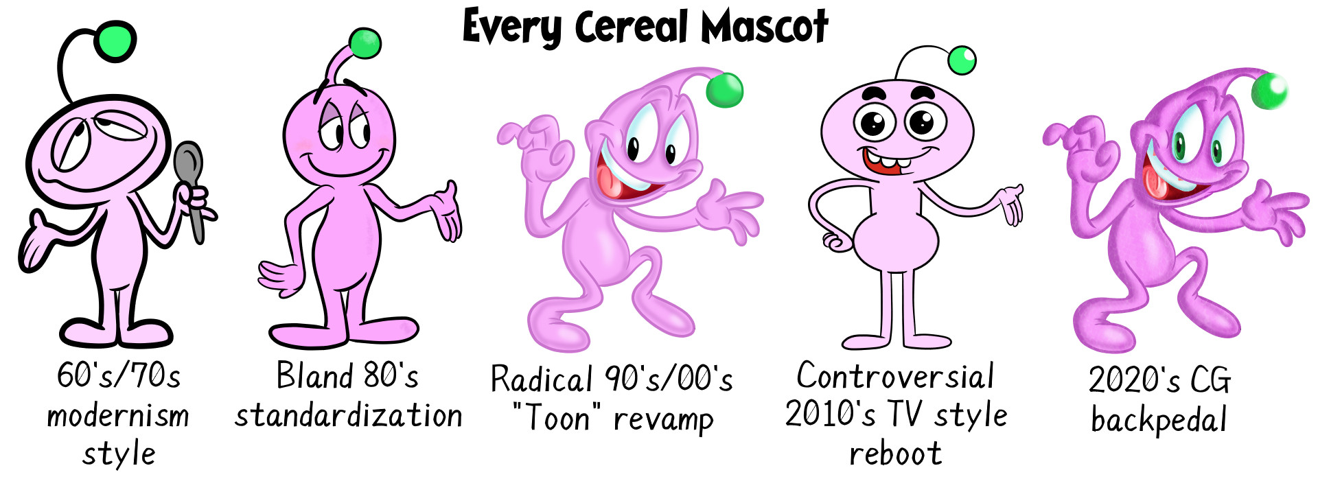
This is great I was going to talk about the cereal mascot evolution in a character design class in a few weeks coincidentally. I've noticed in the final stage the art often has hardened into non-flexible poses and expressions and everything is over-rendered, outlined, and ignores its graphic origins
In other words the final stage has none of the flat, graphic cartooning of the original, and none of the generic but cartoony expressiveness of the 90s/00s revamp. That weird yellow hair thingy on the Rick Krispies guy always comes to mind. They render the hell out of that.

Comments
Even as a kid, I really appreciated the more detailed art and thought the simpler redesign was a load of lazy horseshit.
God, I was a weird kid.
(and the other big G stars if their "satur-yeauhhh" looks extended to the boxes)
2020's backpedal is slightly cursed
2010's reboot is a crime against humanity. Kill it with fire
Every animal mascot back then was either Cool or Completely Batshit
To me radical was more like watching some kid do a sick stunt not unhinged weirdness.
To me this is honestly closer to the gross out side of the 89s than the radical side
It's why I compare it more to gross out cause it's trying to illicit an immediate strong visceral reaction to make it stick in your head.
I remember Nintendo got really weird with its gsme cube advertisements as well as sega being weird with rhe Saturn
Source i was alive back than and saw these commercials and never got ehat they were going for
1992 (right) vs 2025 (left).
Never gonna crackle you down
Never gonna pop around
And rice krispie you