ThreadSky
About ThreadSky
Log In
williesillie2.bsky.social
•
54 days ago
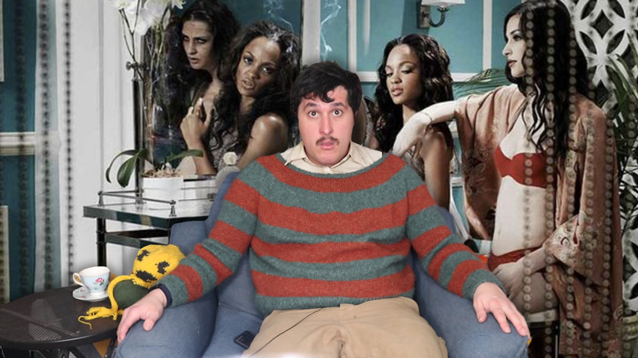
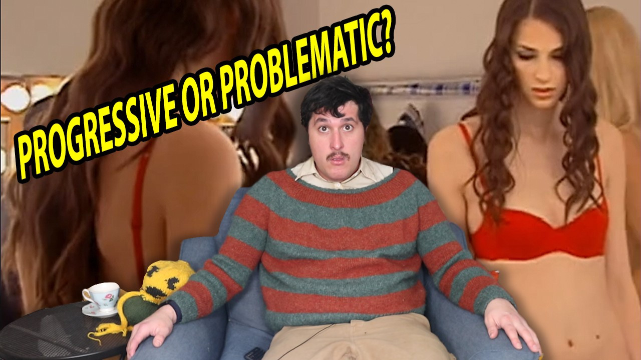
1 2 or 3?
1 / 3
Comments
Log in
with your Bluesky account to leave a comment
[–]
gloupy-birbo.bsky.social
•
54 days ago
1
1
reply
[–]
kaichiiro.bsky.social
•
54 days ago
I like 2 but I dont like how the writing is going over one of the faces and fully blocking it, I'd move it down a bit (unless that was deliberate)
1
reply
[–]
evilplants.bsky.social
•
54 days ago
3 is both the most eye catching and intriguing to me
1
reply
[–]
lokiiago.bsky.social
•
54 days ago
Hmm 1 or 2
1
reply
[–]
lauderthanbombs.bsky.social
•
54 days ago
2 🤔
1
reply
[–]
magmafrost13.bsky.social
•
54 days ago
I like the layout of 2 but the saturation of 3. 1 and 2 both have way too little vibrancy to grab attention
2
reply
[–]
adudofmilk.bsky.social
•
54 days ago
I like 2 but feel like 3 would snatch peoples' attention better.
1
reply
[–]
electricclown.bsky.social
•
53 days ago
1 looks the best but 2 and 3 look the most clickable, probably 2 most of all
1
reply
[–]
tessa-fae.bsky.social
•
53 days ago
1
1
reply
[–]
mivecinototopo.bsky.social
•
54 days ago
3
1
reply
[–]
gutcake.bsky.social
•
54 days ago
I'm leaning towards 1
1
reply
[–]
strawberryfaerie.bsky.social
•
54 days ago
I like 2. It draws the eye around the image. It gives me the impression that you're trying to separate yourself from the subject matter
1
reply
[–]
boypussydivine.bsky.social
•
54 days ago
Definitely not 1
1
reply
[–]
covertlinebacker.bsky.social
•
54 days ago
3
0
reply
[–]
rikarudo1.bsky.social
•
54 days ago
1
1
reply
Posting Rules
Be respectful to others
No spam or self-promotion
Stay on topic
Follow Bluesky's terms of service
×
Reply
Post Reply


Comments