
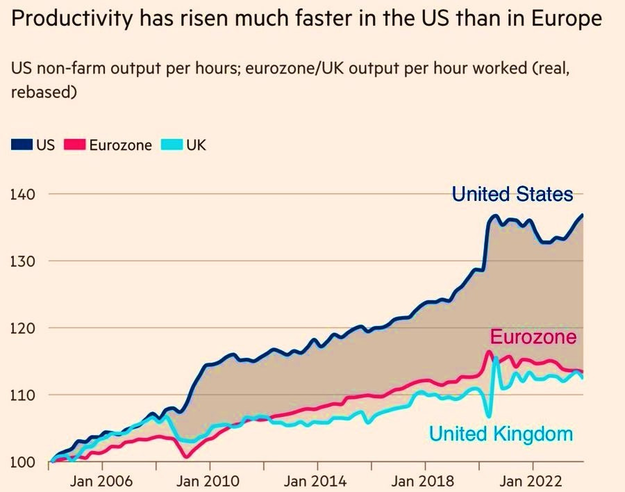
I find this chart fascinating.
Most of all the post financial crisis divergence.
It looks as if the GFC drove a positive productivity shock in the US, but a negative shock in Europe.
Most of all the post financial crisis divergence.
It looks as if the GFC drove a positive productivity shock in the US, but a negative shock in Europe.
Comments
I think big tech might be important in the trend divergence post 2010/11, but I don't how that can explain the productivity moving in *opposite* directions in the teeth of the GFC.
Obviously more complex etc etc
So it's government spending?