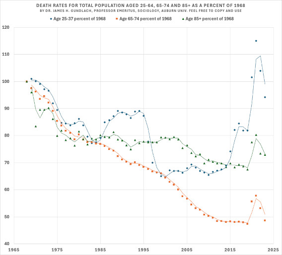
Death rate changes for age groups 25-34, 65-74 and 65+ as a percent of their 1968 death rate are shown in the complex scatter plot. See text in ALT for a description and some explanations.🧪💡☠️
Comments
Log in with your Bluesky account to leave a comment
Sample size? USA? And your legends and title don’t match up. Fascinating though - lower age band hump from mid-80s to mid-90s is interesting - impact of AIDs?
I am not sure which data set you are referring to. Most of the data I work with is 100% census, mortality, and occasionally birth. The major exception is the decennial data on Evangelicals. It is sample data but it has been repeated 5 times and is very stable. Population data does not use p's.
Not quibbling about p factor, for the reasons you describe, just checking geographic scope (I’m assuming USA) and suggesting you correct captions, to avoid confusion!

Comments