
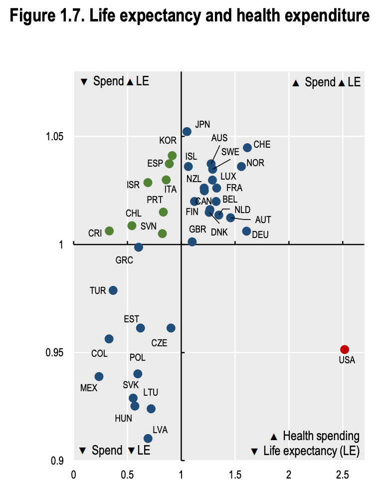
Check out this scatterplot of health spending per capita (x axis) & life expectancy (y axis) in OECD countries (lines = averages).
The United States sits alone in the bottom right area due to its very high spending rate and below-average life expectancy.
More https://www.oecd-ilibrary.org/social-issues-migration-health/health-at-a-glance-2023_e858d3ce-en
The United States sits alone in the bottom right area due to its very high spending rate and below-average life expectancy.
More https://www.oecd-ilibrary.org/social-issues-migration-health/health-at-a-glance-2023_e858d3ce-en
Comments
NHS is a religion in UK but as this demonstrates there are better systems out there. Especially since NHS model not delivering and unsustainable
Also worth noting this is a very crude measure of "success" and shouldn't form the basis of any decision making.
Source: https://www.medrxiv.org/content/10.1101/2024.07.26.24311071v1