As a marketing professional and sensorial strategist I could explain why the pack designs have to have a splash of milk.
But that would be too boring.
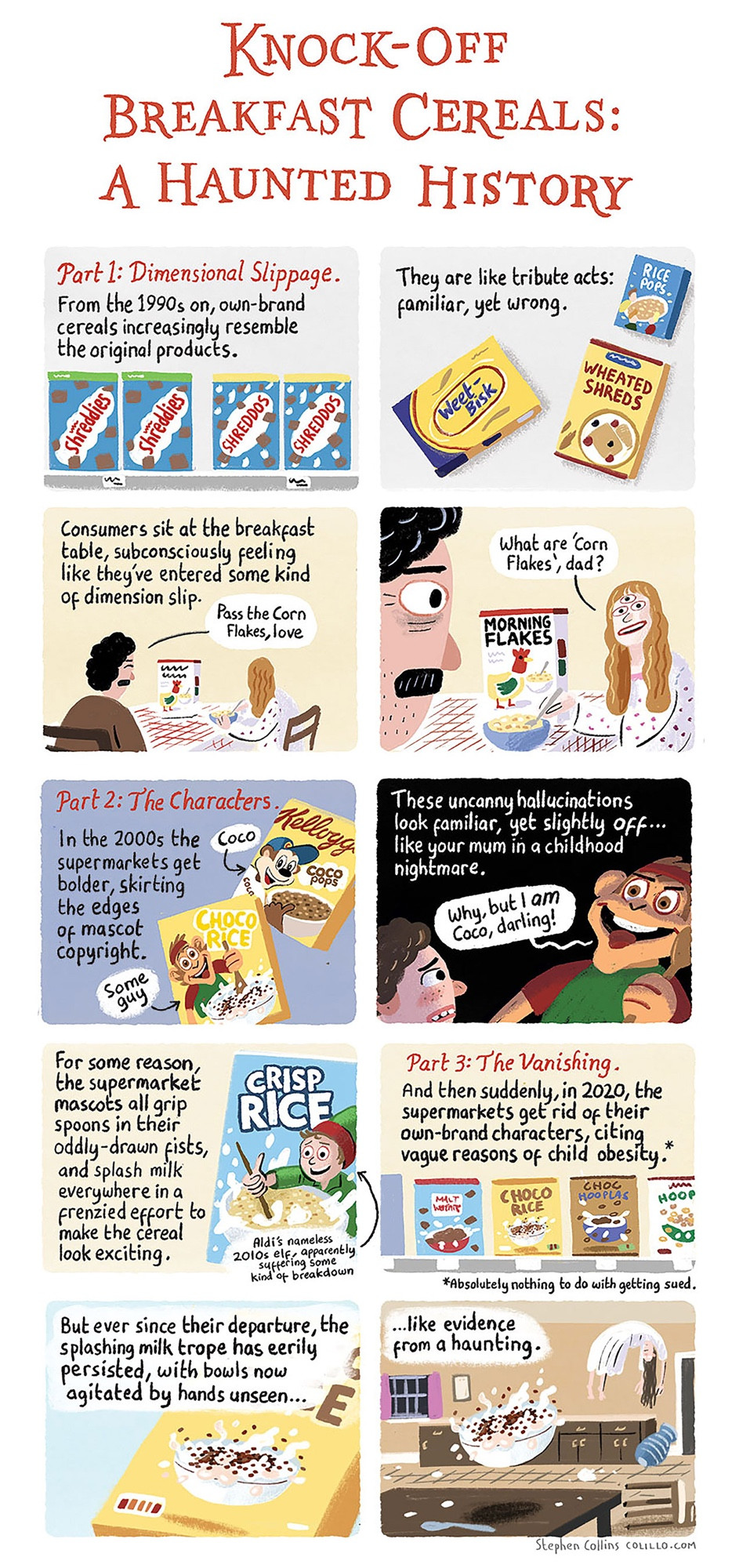
I much prefer the haunted bowl and coco-polt explanation.
Pretty much yes! Splashes coming out of the bowl suggest active enjoyment and promise of satiety/bounty. Fluid movement appeals to the (pre)sense of flavour and acts as an appetising counterpoint to the crunchy/crispy texture of the cereal.
You see, this is why twitter used to be good. What a great answer - thank you. So has all that stuff been like scientifically researched then? Or is it all vibes? Vibes would be valid of course - but how do they know all that stuff?
Yes most of it is science of the senses. For a marketing sensory project you have to include proof points from the research. But vibes are also good! 😊 btw white wine tastes better if you listen to Blondie. FACT.
My mind is regularly blown by this kind of finding.
FACT: Every kitchen and breakfast nook in the UK has, BY LAW, at least one brick, stone or screaming human remains from a cursed burial ground or plague pit built into it. I can’t say that’s helped the situation much.
I too was haunted - nay, DISTURBED by this violent phenomenon of visceral milk, until I met my lord and savior Jesus Christ. May I email you a pamphlet?
If I understand "serving suggestion" rules on packaging... They have to be real photos. So I assume they have glued the outer circle of "Coco pops" together... Then filled some form of inner well with (?) milk. Then dropped a glued blob of pops into the milk...
And took 📸...
Oh this is all heavily comped/retouched. My guess would be, they were happy with another cereal product in their range for which this central splash worked (larger cereal, maybe a spoon?) and then someone went “just use that on the rest” & no-one ever questioned it.

Comments
But that would be too boring.
I much prefer the haunted bowl and coco-polt explanation.
My mind is regularly blown by this kind of finding.
And took 📸...