
I don't have Parkinson's, so my opinion does not matter, but having used @parkinsons.org.uk as an example of a great charity, I am somewhat disappointed by their new logo.
Here is the before & after. What do you think?
🧵
Here is the before & after. What do you think?
🧵
1 / 2
Comments
I wouldn’t have considered the slogan as part of the logo (on the left). And having its name in that font was a pretty weak logo, IMO.
The strapline was a part of the logo and, I thought, was a powerful commitment to what they were about.
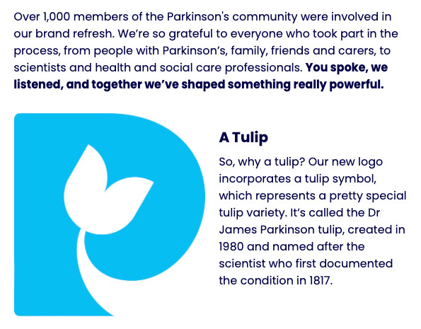
I associate a flower with death... 😕
Interesting about flowers. I associate them mostly with love, summer, joy and nature. And I don’t associate tulips with death
That it hasn't resulted in any therapies is very frustrating, but medical research can be incredibly low.
I would say that compared to some other medical charities, Parkinson's UK appear a high performer.
But I suspect people with LongCovid and ME/CFS may challenge the idea that it is the fastest growing neurological condition in the world.
https://neurology.ufl.edu/2024/02/19/michael-okun-ending-parkinsons-disease-a-prescription-for-action/
The opinion shared on that website does not appear to be supported by evidence.
https://link.springer.com/article/10.1007/s11606-024-09290-9
That logo showed an organisation with a mission so important that it was stamped EVERYWHERE!
I wish. I WISH that there were an ME charity with such a clear mission. Perhaps "Solve ME" gets close?
It has the visual impact of "thoughts and prayers".
"Sorry we can't help you. Have a flower to feel better".
But a logo should be instant! It should communicate fast! Who has time to think and interpret the artwork?
If you have to explain the logo, then it has failed.
But flowers are associated with the dead - we give flowers at funerals, we put flowers on graves.
Are they now just 'accepting the inevitable'?
I really hope this isn't a step backwards.