
it’s crazy that after a over decade so many people still don’t realize all the mega pokemon are designed after either the letter X or Y
1 / 4
Comments
Except for Mega Manectric, that thing will always look like a Z to me 😅
*starts flipping through all the megas*
...huh
I'm not convinced unless they confirm this. but still an interesting observation.
Well I'll be damned.
The existence of regular pink pokemon elsewhere doesn’t mean the “island of pink pokemon” isn’t a thing lol.
I noticed Blastoise's head kind of has an upside down triangle, which somewhat has a Y shape
-Me, about a day ago. I can’t believe this never occurred to me before.
Huge if true
... I never realized....
The likes of Sableye and Ampharos are a stretch and Kangaskhan is just the baby with adult patterns.
But some are definitely X and Y like Medicham, Mawile and all the starters.
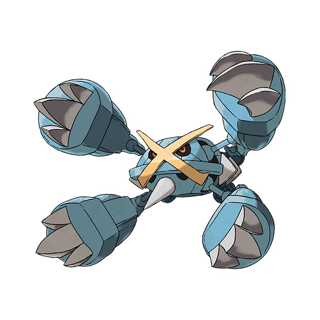
So saying "Look guys, Mega Metagross is X themed" I can't help but chuckle a bit and just circle the GIANT X on his base face.
Rather, out of all the character design choices they could have made, megas specifically stayed between those that would thematically fit the design of an "X" or "Y".
Some are definitely subtle.
But I NEVER thought of this
Mega Sableye being one noticed from the legends ZA trailer that it has a hole in its chest from the big crystal popping out and it leaves an X mark .
Mega Gardevoir, Gallade, Lopunny, and Mega Lucario (the tutorial Mega btw) don't fit X's or Y's
Sableye: the head spikes are larger, giving its overall body a Y-ish shape.
Gardevoir: The chest spike is two pronged in front, one in back like a Y
Camerupt: ⅄
even if the pokemon themselves don't resemble the letter exactly, there is an obvious 4-pronged and 3-pronged element to their designs for X and Y respectively
I think Xerneas, Yveltal and Zygarde are way more obvious and intentional in their XYZ designs (as well as the colours that represent each direction in space seen in 3D software gizmos) but if you didn't know, it's subtle enough