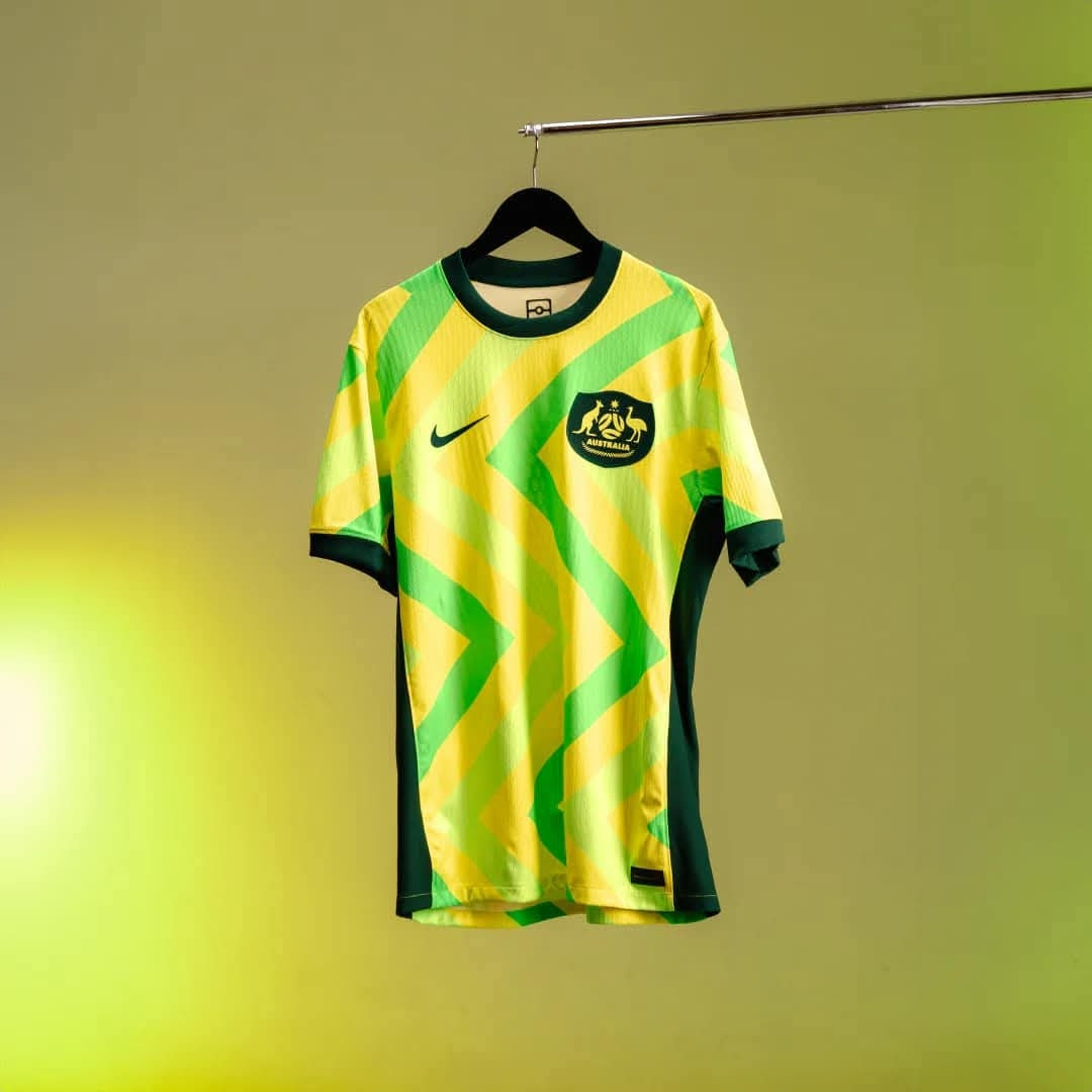
Fluoro green is one of my least favourite colours, so this jersey was never going to be one for me. Particularly next to the yellow, it looks jarring for me.
Appreciate the fact they involved a First Nations artist and would love to see more of that from going forward.
The away kit does look a little too African confederation for me but it still is a pretty nice kit TBH. Much better than the odd shade of green we had of late.
Yeah I like the away, and don't mind them trying different things. Would have liked to see them do what the Wallabies did and incorporate indigenous art into the design

Comments
Appreciate the fact they involved a First Nations artist and would love to see more of that from going forward.
For me it kind of harks back to a world series cricket kit which adds some nostalgia for me; I also really like how the badge has been done.
We've had better kits but I'd rather something different once in a while than the same solid yellow with small detailing.