Reminds me of my time in artschool, we got this explained in the first semester then hammered into us on the second. It's such a neat set of rules and I love how I've gotten better at composition from knowing them.
I might add: details create contrast, but too many details make it cluttered, making a larger field of just Noise that ceases to have internal contrast at all.
If everything is contrasting, nothing is. Keep it as simple as possible so non-simplicity has more impact.
As stupid as it probably sounds, thank you for posting examples of these in use as well. My aphantasia can make it really hard to figure things out 'in context' but now I can go OH LIKE THAT and actually get it.
The fact that "Grouping" is the odd one out in isolating the 4th item instead of the 3rd that every other one does is like a meta-level standout-method XD
I try to do the same. If it's about simple icons one can also work with different shades. I've seen it in a bunch of match 3 mobile games, where the things you match have different colours but also different shapes around a certain theme. (A green leaf, a red tomato,...) That's pretty neat. :)
This is a wonderful reference for my younger designers/interns. Probably one of the hardest things to teach initially in design is ensuring a visual hierarchy whether it’s the UI, typography, marketing collateral, etc.
It's something I do know, based on discussions with my interns, isn't emphasized as much in college at the moment. I went to art school in the mid-2000's and, due to print collateral still being so prevalent, we got drilled with proper hierarchy techniques since we had finite real estate to use.
It doesn't make sense to me that they stopped - sure, a website may have theoretical infinite scroll, but only so much fits above the fold and mobile optimization reduces that. Most of what I've needed in recent years is social, email, display ads - all very finite spaces.
Oh there's nothing wrong with it, but like you said if it's the only piece of visual information then there's going to be trouble for colorblind folks.
I know you're joking but the problem is more that it's being implemented poorly here. They could've just as easily made those ledges protrude more, or make them grassy or flowery, or anything that would make more sense than inexplicable yellow paint.
This is the fault of "we want better and better graphics" with the lack of "we can interact with everything we would in the real world". The yellow paint is what's left from the list above if you want to have it look realistically (theoretically someone could have painted that yellow :p)
I’ve been thinking about this a lot since doing my Klimt inspired piece. I love how the OG gets you to focus on the woman’s face. It uses multiple methods but one is the opposite of noise.
As I drew more flowers and added detail to the wings, I could focus more on the subjects.
Love this! I think of noise as 'detail' instead as it sounds more neutral to me (just personal pref). You added several forms of contrast that I never think about - very useful!
When you say noise what exactly do you mean?Like a lot of things/stuff happening in one area? (I'm a little embarrassed that I'm not sure what it means)
Reminds me of how in House of Leaves the word House throughout the book is in blue in color editions or in an offset/raised font to draw attention to it.
Using multiple of these aspects at once is impactful, but can create stylistic dissonance.
It's worth considering what you want your overall impact to be, and locking a few aspects in. Bluey for instance locks in rounded square-ification as a shape language to keep a friendly vibe.
Been thinking abt this lately bc my whole life everyone screams “value is paramount to all else” to the point where hue/etc dont matter if ur values are strong! And yes, but like, sometimes i dont want a strong value contrast. I need to experiment more w focal point via hue, edges, etc
The hue and saturation is super interesting to me because even though im colourblind, i can still see the one that stands out (the others look the same LOL)
Eyes are NOT as sensitive to hue changes as value, and it will somewhat tire them out to distinguish it en masse. Also, colourblindness messes this contrast
Also, not sure if saturation example isn't actually value differentiated, though that might be my screen? Colors are fun :D
Comments
📌
Thanks for posting on bluesky as well
If everything is contrasting, nothing is. Keep it as simple as possible so non-simplicity has more impact.
what is this about?
I tend to fix this issue for myself by combining hue and value - so that if I can’t see the colour difference I can at least a difference in value.
But I avoided using the word ‘detail’ because detail has connotations of effort, value and intentionality.
Noise can be the texture created by brushstrokes, or the visual noise of a dense paragraph, or a crowd in a photograph.
Invaluable information. And thanks for including a couple of examples!
As I drew more flowers and added detail to the wings, I could focus more on the subjects.
Very helpful thank you for creating this!
clear and simple.
But I avoided using the word ‘detail’ because detail has connotations of effort, value and intentionality.
Noise can be the texture created by brushstrokes, or the visual noise of a dense paragraph, or a crowd in a photograph.
This is POWERFUL storytelling!
It's worth considering what you want your overall impact to be, and locking a few aspects in. Bluey for instance locks in rounded square-ification as a shape language to keep a friendly vibe.
An example (https://artstation.com/artwork/vxvxO)
What makes you look at the focal points(s)?
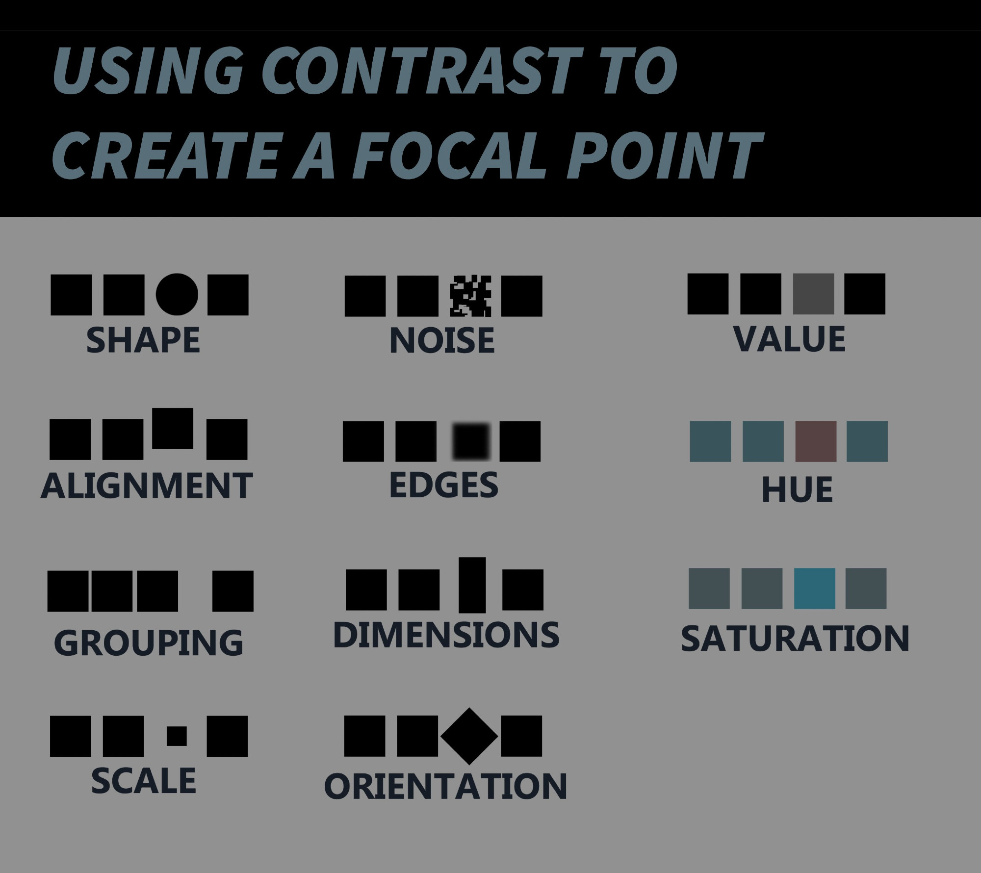
For this, the big ones are:
- hue
- value
- grouping
- saturation
- scale
- edges
fantastic contrasts of:
- value
- shape
- noise
- hue
- saturation
Though tbf, the audience generally won’t have the same limbic/emotional response to each of these gestalt elements.
Some of them - like value - are punchier and more attention grabbing than others - edges are pretty subtle and lower impact for instance
📌
Eyes are NOT as sensitive to hue changes as value, and it will somewhat tire them out to distinguish it en masse. Also, colourblindness messes this contrast
Also, not sure if saturation example isn't actually value differentiated, though that might be my screen? Colors are fun :D
📌