
Is it just me, or does it feel like the ART on Yugioh cards has become more generic the last few years?
We used to get a pretty wide range of monsters, both in subject and style.
But ever since Vrains ended, it feels like the style has consolidated significantly.
We used to get a pretty wide range of monsters, both in subject and style.
But ever since Vrains ended, it feels like the style has consolidated significantly.
1 / 4
Comments
If we compare Branded Fusion to Polymerization or Imperm to Negate Attack, there’s a noticeable improvement.
But I've also never thought Yugioh's art was particularly good to begin with.
League of Legends gives more skins to hot human(ish) male/female/etc characters and almost none to monster types for this reason,
Sadly yugioh is doing the same thing with newer archetypes too.
-Anime characters
-Dragons
-Robots
-Cute animals
-Horror
-Cartoon style
Strangely though, despite them being cat/dogs and robotic warriors respectively, both the Purrely and the Therions come off as really anime-coded to me.
Like, they aren't JRPG characters, but they ARE summons.
Purrely's anime eyes and Therions' human-like anatomy pieces are very central but... still the most different I could find in the last few years
Primite is just more dragons.
White Forest SPELLS have a cool storybook motif, but they don't extend it to the monsters, which are just generic anime peeps.
Ashened is the one you mentioned that does look distinctive... and I think that's mostly because it's a TCG exclusive, and the TCG still tries to be unique.
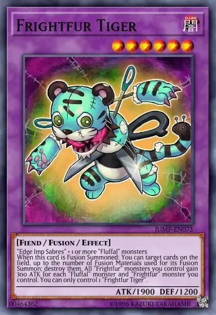
(pretend there's a 5th image of Purrely)
The White Forest monsters could have been illustrations in a children's book or marionettes.
And the IceJades could have looked like Aquatic spirits of jade and ice, instead of just translucent humans.
We've had stuff like memento retraining classic cards-
The Albaz and Visas archetypes all resemble each other for lore reasons though, much like DT and WL.
I can agree that Nemleria, Ragnaraika and Nouvelles look unique, but Gold Pride and Mikanko both fit over-complicated anime style, and Mulcharmy look like a retrain of Leafplace Plaice 😭
Mulcharmy looks nothing like Leafplace.
Vaguely animalistic thing with a cartoon face and one part of the design with more details than the rest of the design
Now we used to have lore within the card game but they were never as concise as the ones we had and felt a lot more like mythos. So the monsters didn't really
With the anime the designers had to come up with unique designs that each fit a characters aesthetic that didn't have to be in the-
Those are: Mulcharmy, Ragnaraika, Suship, Floo, Nemleria, Mimighoul, Tistina, and Ghoti.
And the last 3 are TCG exclusive.
And tbf, most of the waifu decks have similar/same artstyles - and those decks do sell well.
I'd love to see more of the obscure artstyles we've had return though!
Those archetypes all have unique art, but they also aren't developed in the main Konami HQ
Like, I'm pretty sure we've had it confirmed by former employees of Konami EU that they got to work on designing some of the cards.
definitely noticeable that they had to throw in a random pretty humanoid woman as the deck core though.
They arrived right at the tail end of the Vrains era, before the art started really consolidating.
As cool as the Albaz lore was, it kind of sucks that most decks just kind of became anime characters.
These Artworks still look awesome though imo
Like it's always been a meme that Yugioh is full of dragons.
but the last few years it feels like half the new archetypes get are themed around dragons, or at least have a boss monster that looks like a dragon.
Mementos and Voiceless Voice manage to look visually distinctive and interesting... but only by copying DM era Yugioh monsters.
The Horus archetype is just drawing from the Ancient Egypt well again. We have so many Sarcophagi in this game now!
Spright Blue isn't exactly an anime character, even if got strong anime vibes.
Goblin Bikers is unique in premise, but the art doesn't reflect the style at all.
I'm curious if there's any newer art that stands out to you?
They seem to be the ones keeping up the Yugioh tradition of having a bunch of unique monster ideas presented in a variety of different styles to suit the theme.
I don't necessarily agree that YGO art is more homogenized but I see where you're coming from
and though it doesn't look any different Re:humanoid designs in the card artwork, the concept art for the Maliss was certainly formatted differently
https://x.com/YuGiOh_OCG_INFO/status/1826960077481521385
But Ghoti and Mimighoul are TCG exclusives, and the Melfy cards come from the tail end of the Vrains era, right around the time this shift happened.
And with the exception of their worst monster, the character designs themselves are just JRPG characters in elaborate costumes.