I actually read them from top to bottom but only because it was presented in the context of a Bluesky post where I was already reading for small text line-by-line. If encountered as an image by itself the typography would definitely have worked but that context can change the effect. Fascinating!
Very good graphic design. They should consider making the title text bigger than the copy text in newspapers, magazines, online publications and letters, too.
It's not a matter of free will tho, it's more a point of situation. In our culture bigger characters are associated with meaningful messages (news/ads/signs). The very small thing at the top instead is just for context most of the time, like times and date in newspapers and blogs
Guess what? I'm illiterate. My posting servant reads posts to me, and he read them in the wrong order just to throw you off your game. Bet you feel owned now.
This is what happens when you think you have outsmarted Words With Friends by downloading the Scrabble App instead. At least I do not see somebody making "millions" playing Solitaire though.
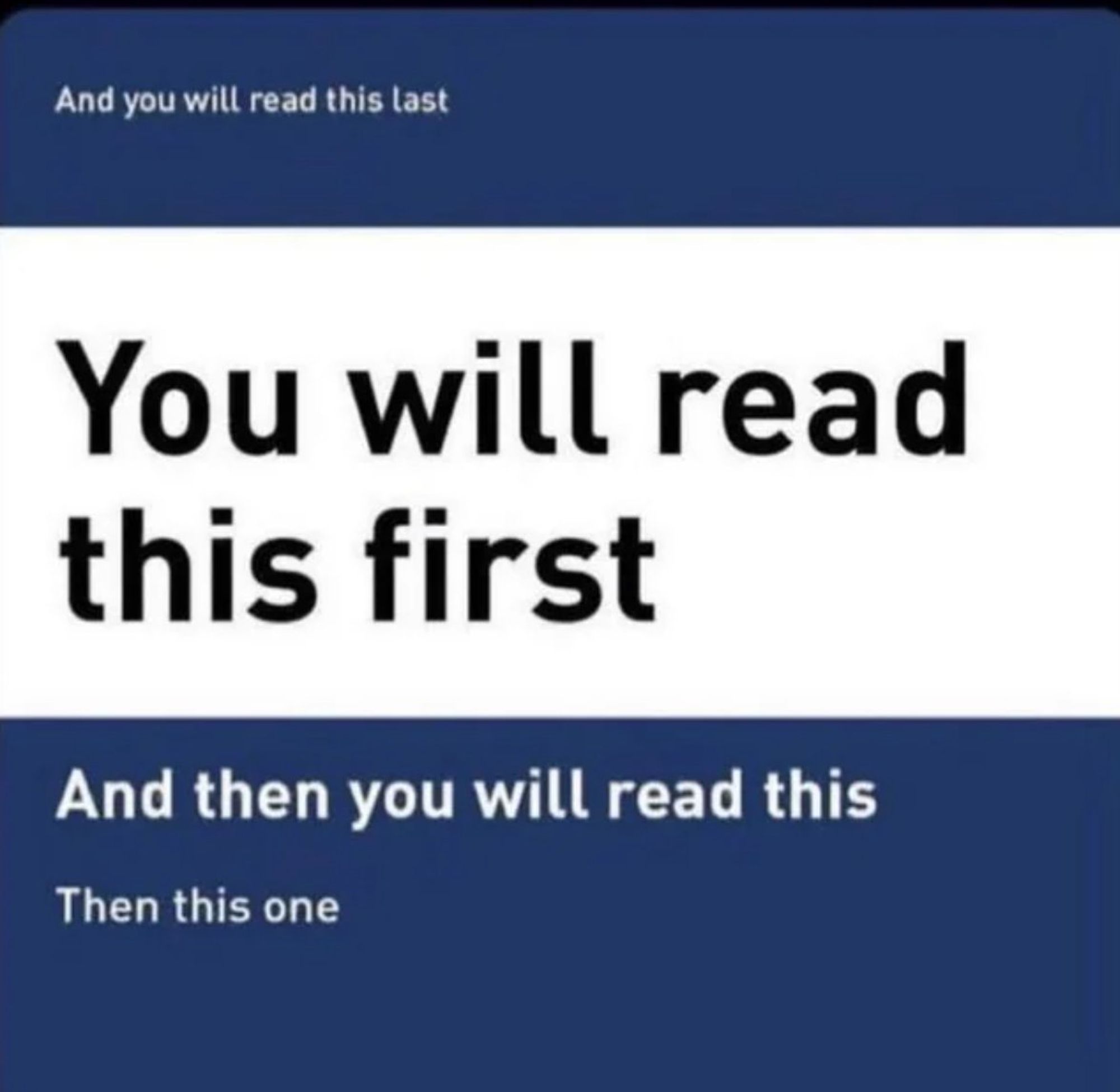
See, this never works on us. We did read the one that said "You will read this first" first... but then we always instinctively go to the top next, so we read the "last" one 2nd and then what was at the bottom last xD
Some of us are but a leaf on the breeze of fate, and when I saw the repost of this in my timeline, all that I could see of it before scrolling was the top line.
So I read the top line first, but by coincidence not free will.
Not to take away from the witty banter by asking a somewhat serious question… Isn’t this more social conditioning than free will? Because I didn’t read any of the text but I want to argue it’s efficacy. Take that, top box!
Comments
The top and bottom are correct
But sorry to ruin the awesome number of comments
okay you got me
I'm not mad
just annoyed
This is why George Joestar II never taught Joseph to write.
🤭
There is a Creator to create free will for all.
So I read the top line first, but by coincidence not free will.
This image is just showing that there’s a common pattern to signs and book covers, and that the top text tends to be irrelevant to parsing the rest.
Fear me