I always found that a nice effect for terrain was to drybrush a dirt colour lightly to the bottoms. Gives it a bit of grim and depth without being too intrusive
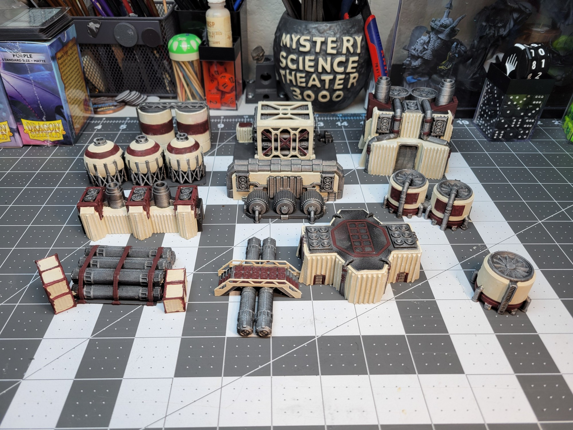
I had to totally change how I painted up some fantasy terrain recently because of print lines. I stippled the entire surface to break ip the colour before adding washes
Yeah, I painted these in the entirely wrong order. I did them all silver then went back over with the too bright beige. I wish I started with a darker color of beige so I could stipple lighter for a more concrete feel, then go back and fill in the silvers.
If you stipple multiple colours I find that the order isn’t as critical unless there is a wide tonal range. I used four shades of grey when I stippled and mixes them up to vary the effect
Comments
I always found that a nice effect for terrain was to drybrush a dirt colour lightly to the bottoms. Gives it a bit of grim and depth without being too intrusive
*fires up airbrush*
I was going to do some oil weathering, but skipping that due to the print lines. This however...