
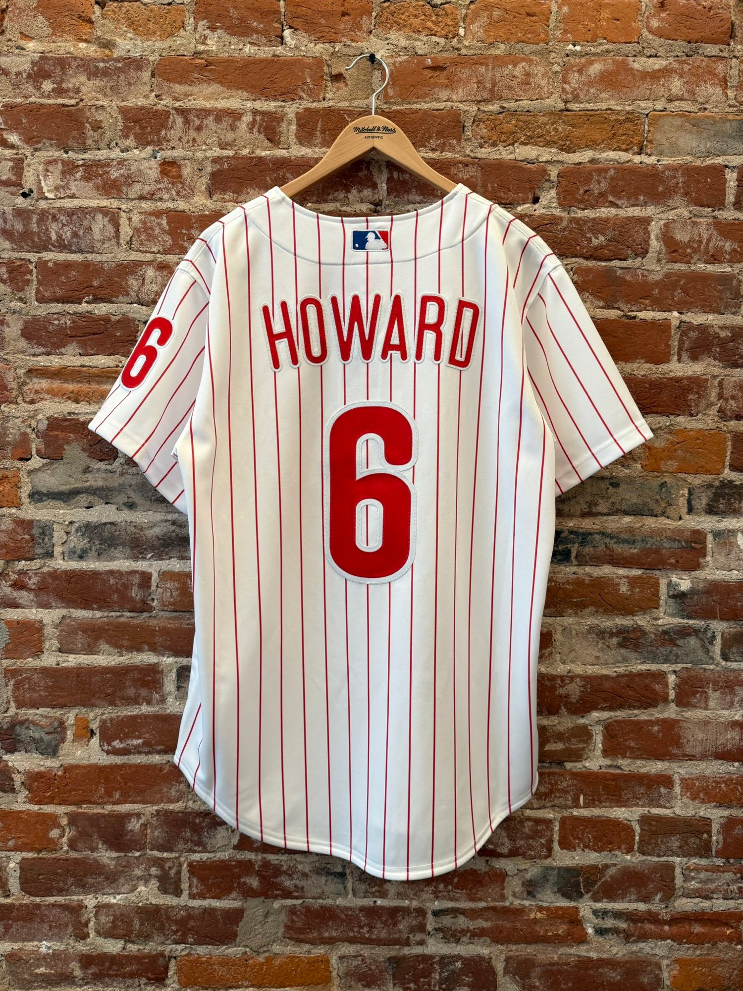
Someone has to say it re: the new Ryan Howard jersey from Mitchell and Ness: It looks like a bad knockoff
1. Placket is *way* too wide
2. Name arch is wrong for this version of the jersey
3. Puckering around the chain stitching on the wordmark
4. Border is too wide on the white part of the number
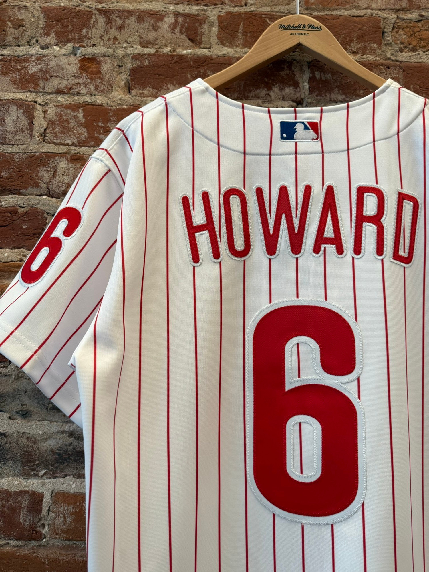
1. Placket is *way* too wide
2. Name arch is wrong for this version of the jersey
3. Puckering around the chain stitching on the wordmark
4. Border is too wide on the white part of the number
1 / 3

Comments
Do they low key have beef with the Big Piece or something? They did him dirty with this thing 😭
It genuinely baffles me that anyone would buy one of these 🥲
Mitchell and Ness *used* to make faithful replicas of the on-field jerseys.
This is hot garbage, and they want you to pay them $300.00 for it lol
🚮
Compare it to a jersey I have from the same era (on the right) 🥲
Twill needs to be glued and never touch heat or else it’ll pucker.
The list goes on and on!
Look how big the fucking numbers are lol 😭